kits from the bottom

A few weeks into the footy season now (I will go back and add the new third kits to parts one and two…), cynicism and apathy are creeping back in, but we continue our look at the 2015-16 Premier League with the last teams in the division.

PREMIER LEAGUE KITS: PART THREE, THE ‘LAST SIX, PLUS ONE’

NEWCASTLE UNITED Newcastle

Newcastle have been very unloved lately, even by their own fans. It’s the owner. The past couple of seasons it has seemed they were trying to create the most apathetic team in history (though overpaid apathy is all too common in modern football). This un-Newcastle-ness has been spreading into the kits, with the much-hated Wonga sponsorship, and this season’s home kit, which features far too much blue. The famous black stripes actually turn blue as they move south, and the reverse of the short is plain white with blue accents, no magpie black at all. I don’t mind a blue trim on Newcastle (think the blue star, or their Asics kits from 1993) but this feels like too much. I’d love for Newcastle to get a different owner and come back with a massive roar, but it isn’t going to happen in this kit. The white away kit is handy if they face any teams who play at home in black (which is exactly none) while the third kit features half a salmon pink sash.

SUNDERLANDSunderland

Both Tyne/Wear teams are in the Premier League, what a joyous time to support a club in the northeast oh never mind. Sunderland were pretty pitiful last year (how on earth did they and Newcastle both stay up?) and so far this season have looked deeply uninterested to the point where the manager Dick Advocaat said all the players are for sale. I have to say though, their home kit is pretty snappy this season. Wider stripes look good on Sunderland (though I’d love a return to the super-thin 80s stripes), and it is a smart cut. The away kit is green, green and green. Green is very popular for an change colour this year. By the way, I think both Newcastle and Sunderland will stay up again, because no matter how little they try, there’s always someone a bit more rubbish.

ASTON VILLAAston Villa

Which brings us on to Aston Villa, who are always a bit more rubbish. Yet paradoxically, no matter how awful they are, they never seem to get relegated, ever. Sherwood arrived to fire them up last season and they stayed alive, but already this year they look like they will run out of ideas fast (they’re above Spurs at the time of writing though…). Their kit supplier, however, will not. I like Macron kits, they’re always a bit more original, and Villa’s kit is sweet, with a collar reminiscent of the 1970s. The away kit is clean, and I’m always a fan of Villa’s yellow away kits (I like most yellow away kits, in fact) (did you know, for example, that Tottenham’s yellow change kit tradition stems from the fact that they had to ditch their usual navy kits when the it was deemed too close to the black shirts of referees? It’s why black kits were so rare until the Premier League era, when refs started wearing green, followed by other colours; Man United started the modern black kit trend in the English top flight in 1993-94, and many, many others followed, while yellow kits have been seen more rarely, only once every few years now at Spurs). Villa’s traditional away colour, incidentally, is white.

BOURNEMOUTHBournemouth

Oh sorry, I was doing Premier League clubs, I’ll get rid of this one.

What? Bournemouth are in the Premier League? BOURNEMOUTH? How did this happen? Well, they damn well earned it, that’s how. Eddie Howe, in fact, their brilliant young manager, created a free-scoring team that topped what was a very difficult Championship (what a season last year was! More interesting than the Premier League by a long way). I hope they do well, and hope they stay up. We’ve had some teams that joined the Premier League over the years that were pretty gobsmacking additions but did reasonably well for a while (Fulham, Barnsley, Wigan, Reading, Swansea) (by the way, how good are Swansea this year?!) but none have suprised me as much as Bournemouth. Ok, enough gushing, their residents have to be in bed early. The kits are nice, black and red stripes being the Cherries’ modern tradition since the 90s (though they had them for a while in the 70s), and there’s the Mansion sponsor again. The blue away kit is alright, while the pink will really stand out – less Cherry, more Strawberry Milkshake.

WATFORDWatford

I remember when John Barnes was young, Graham and Elton having so much fun, playing cup finals and wearing red shorts…I can only go so far with this. I’m so glad Watford are back in the Premier League. I grew up roughly halfway between Watford and Tottenham, so have always had an affinity for the Hornets not as a second team exactly, but because I’ve known a few Watford fans, and they are a lot nicer than Arsenal, Chelsea and QPR fans. So, they’re back, and yeah, it isn’t going to last, and they may go through a few managers, but they have a very nominative-deterministic home kit. They are the Hornets, you see. Oh and they have a red stag as their badge. Black shorts is the tradition, but I like red shorts on them, because it reminds me of the glory days of the 80s. The away kit is all black. They are also sponsored by a betting company  – do you notice that more teams in the ‘lower half’ as it were have sponsorship by betting companies? I’m sure there’s no correlation, and betting companies don’t hold the game in its sway or anything. Newcastle are sponsored by loan sharks, while Villa are sponsored by accounting software, and Norwich by an insurance company. Money money money.

NORWICH CITYNorwich

I love Norwich, because I have family up there. but I also like their kits when they are made by Errea. Errea make smart designs in the Italian fashion, and this year’s Norwich kit is interesting, bringing more green in to make halves. IT uses up all the green and yellow at the cliub though surely…oh no, the away kit is green with yellow pinstripes. Ok, maybe the home kit feels more yellow, so this is sensible, you know, it will look good against Watford, or Sweden, but in the unlikely event of playing the Nantes team of 1995, they must have a third kit that is blue or white or OH WOW. Ok, um, the third kit is yellow and green. And gold? With black shorts. Right. Er…it does actually look fantastic. No seriously, I LOVE this kit. Norwich and Errea have done it again. This kit reminds me of the style worn in the 1870s by those early teams  such as Wanderers or Royal Engineers, or later teams like Bradford Park Avenue.

…and an honourable mention for:

OXFORD UNITED (LEAGUE TWO)Oxford

Oxford aren’t in the Premier League, don’t worry. That would be as ridiculous as saying Bournemouth were in the Premier League! (Hang on…) But their kit this season gets an honourable mention because it harkens back to the mid 1980s, when Oxford were not only in the old First Division (hey kids, that’s what we used to call the Premier League) but were actually a pretty decent team, even winning the Milk Cup (hey kids, that’s what we used to call the, um, er, what is the League Cup called nowadays?) John Aldridge played for them, so did Ray Houghton, in fact you might say the Oxford of 1986 beat the Italy of 1994. Dean Saunders played for Oxford in the 80s too, and Malcolm Shotton, er, Trevor Hebbard, you know, the list goes on. This season’s home shirt is made in-house and resembles that 1985-86 kit, which was made by Umbro. They’ve been promoting it with an 80s-style Subbuteo theme. The red and black away kit is a throwback to an away kit worn in the mid 1990s when they got promoted from the old Division Two to the old Division One. Yeah, those past glories.

There will be another kit-related post soon, looking at some of the teams from around Europe. But fear not! Drawings of Legos and streets and buildings will be back soon…

every. thing. awesome.

Legoland entrance, California

If you’ve been following any of my posts lately you may have seen that we like a bit of Lego, chez Scully. Last weekend we wet to Legoland, where everything actually is awesome. It was our second trip to Legoland California (and we went to Legoland Windsor last year too), and you might think that, well Pete loves sketching, he loves Lego, he loves sketching Lego, perfect yes? Well this was the only sketch I did, I was having too much Lego fun! It’s a great place for a seven year old (I’m not seven by the way, I’m pushing forty). We stayed a night at the Legoland Hotel, in a knight-themed room, and spent a lot of money in the Big Shop. What was nice about this trip was we spent the afternoons either at the hotel pool or at the really fun Chima water-park. Legoland is small enough that you can fit a lot in all in the morning, and it wasn’t particularly crowded, which was a surprise for the summertime. Last year at Windsor we waited almost an hour and a half just to get in! Here in Carlsbad there were very few long lines for rides (unlike at Disneyland), and we could just go back to the hotel for a rest if we wanted. The Star Wars section is better this year, with a huge Death Star and a bit where my son and I built little spaceships. Yes, everything was awesome. We will be back.

those magnificent lego men and their flying machines

ninjago ronin rex

I hope you like Lego, because you’re just going to keep seeing more of it on this sketchblog. Denmark’s Greatest Invention. Occasional bane of my bare feet on the carpet. I’ve been busy Lego-sketching, especially mini-figures, so many mini-figures. You’ll get to see those once I’ve coloured them in. That won’t take too long. In the past week I have also been to Legoland, where you might imagine I did a lot of sketching. You might imagine it would be the perfect sketch-paradise for someone like me. Well in fact I only managed one sketch because Legoland is so much fun! More on that another time. This was done before the trip, and is one of my son’s newer Lego sets, the Ninjago Season 5 ‘Ronin REX’. You have no idea the anxious wait for the season 5 Ninjago stuff to come out (my son’s anxious wait, not mine, but yes mine too). It was agonizing, and all the more so because when I had been in England in June I had seen all of these and didn’t buy any to bring home, figuring they would probably be out in the US already (same reason I am still new-Tottenham-shirt-less). Two months he waited, saving his money (I say his money, I gave it to him). In the meantime the show came out, and then finally the toys were in the shops. He really wanted this particular set, which has one of those Airjitzu things actually built into it, and he even entered a competition to win it, just in case (I told him that if he does win, we’ll keep the second one in its box and sell it in a few years time for three times the original price). This is the flying vehicle of the Han-Solo-esque scoundrel character Ronin, introduced in season 5, and I must say that the shape of the ship (and the colour scheme of Ronin) really reminds me of Slave 1, Boba Fett’s ship. I drew this in the book of my son’s things, which is becoming ever more Lego-heavy. As it should!

you terrestrial gastropod molluscs and your guns

slugterra blaster

This is another of my son’s toys. It is called a Slug-Terra Blaster, or something like that. It is what they use in the TV show “Slug-Terra”, which he really likes. It’s actually not a bad cartoon, but the premise of it is that they are in some sort of underground world where slugs are not only intrinsic to the society somehow but are used as weapons. Well, they fight on behalf of their owners, a bit like Pokemon I suppose, I don’t know. All the slugs have different abilities, some get really close to their owners, and then they get blasted out of these things, and then it’s all zap, pow and ka-blam. Oh there are evil slugs too. Now these slugs are all different colours and have names, but this isn’t a society of slugs, the people are all either humans (I think), trolls (maybe), or weird mole-folk (I really have no idea). One of those has a comedy Mediterranean accent. Or are the evil slugs zombies? Or wraiths? I don’t actually pay much attention. So you can imagine my son’s excitement when we spotted these at Toys R Us (I always wonder how that store got its name, did they got through a lot of other stupid combinations before settling on that one, “Toys Am We” “Us Is Toys”, “Toys Er America”, “Help”) (I used to call it “Toys Ya Us” because that backwards R looks like a Russian “Ya” (я). This was during the Cold War as well so I’m surprised people didn’t think it was some sort of Russian spy agency, I mean it all fits in the name…Cold War conspiracy theory at slightly higher prices than other stores, I like it!). So, this doesn’t works like a toy gun with a trigger (we’re not really into the toy gun thing, all the Nerf rubbish. Fingers and saying “pew! pew! pew! is fine though). Instead, it has a spring mechanism inside, you pull back the handle, let go and the little slug comes out. He has another blue one which looks cooler than this but I didn’t draw it, so you’ll have to imagine how cool it is (or watch the show! If you watch the show maybe you can help explain it to me).

where the streets have a slightly different name

Streets pub Sacramento
This is the midtown Sacramento pub called ‘Streets’. Click on the image to see it in closer detail. This pub was formerly known as the ‘Streets of London’, but they decided to drop the ‘of London’ part presumably in an effort to appear more inclusive to the other metropolitan centers of the UK and indeed the more rural counties. They could have gone further and called it ‘Lanes’ or ‘Highways and Byways’. They have an actual National Express Coach-stop sign outside the pub, and still have a number of British-themed (specifically London-themed) objects in the pub, but not as much as they used to. When I first came here back in 2006 or whenever it was, they had football shirts and scarves hanging from the ceiling. Those are sadly long gone (and you know how much I love football shirts). Otherwise though the pub really hasn’t changed a lot. One TV ahead of me was showing the Giants baseball, another was showing French football (which these days just means ‘PSG and someone else’, you know how much I don’t like seeing PSG). It’s been a long time since I was in here last, but I have wanted to do a panorama sketch of its brick walls and cozy layout for ages. I hadn’t planned on it; we spent the morning in Arden Fair mall, mostly at the Lego store (and you know how much we love Lego). I then took the opportunity to go to midtown Sacramento, to look at all the goodies in the University Art store on J Street. I picked up a ‘Cathedrals of the World’ colouring-in book (and you know how much I love drawings of the Cathedrals of the World). I then wandered about looking for something new to sketch, but by now it was hot, very hot. Very very hot. I considered sketching the historic Governor’s Mansion (which I last drew in, um, 2007) but could not find the right angle, what with all the big trees in the way (stupid trees, providing shade from the oppressively hot sun and the air we breathe). Maybe I will come back in winter.

By this point, the searing heat was giving me a headache, and I had to cool off urgently. So I went back over to Big Brother Comics on J Street, bought the latest issue of ‘Thors’ (one of the very fun and inventive books from Marvel’s ongoing ‘Secret Wars’ event; the ‘Thors’ are like the cops of Battleworld, and this plays like a classic cop drama, but, you know, with more hammers and lightning), and popped into the Streets of London pub to cool off and read. Sorry, ‘Streets’. No more humming Ralph McTell. After finishing ‘Thors’, I thought, ah what the hell (sorry, what the ‘hel’, Thor joke) and started to sketch a panorama. I sketched quickly and drank my two beers slowly (one after the other, not slowly at the same time). It wasn’t particularly busy, but the staff were friendly and the atmosphere nice. At one point a large party of Sunday pubcrawlers came in, had a pint, and left. I remember this being a thing the last few times I have been at this pub. There are a bevvy of boozers in midtown now, and I imagine an afternoon pub-crawl with all your friends on a hot Sunday in mid-August would be quite a lot of fun, but you don’t get to spend long enough in any place to enjoy it before the fastest drinker in your crowd claps his hand loudly and orders you to move on (that’s what happened here). They do have these pedal-powered contraptions now that groups of people ride on, all pedaling, drinking water, being directed from pub to pub, while yelling ‘wooh’ and ‘yeah’. The pub returned to quiet Sunday afternoon peace very quickly, but I had to get the bus home to Davis. I finished off adding all the paint the next day. Another pub sketch checked off the list!

building the pitzer, part three

pitzer center uc davisContinuing my series of sketches showing the Ann E Pitzer Center going up on the site of the old Boiler Building. Two different angles a week apart, you can see that the front frames have gone up now, rising like a musical crescendo (is that the word? I don’t do musical terms). Exciting work this summer…pitzer center uc davis

enter the bladecopter

ninjago bladecopter
More Lego, drawn in the book of my son’s stuff. This is the Ninjago Blade-Copter (the what, i hear you ask?), a recent addition from the season before the most recent season of Ninjago. You have to live in this world. So, in season 4 of Ninjago, the ninjas travel to an island to take part in a martial arts tournament organized by the mysterious Chen (who normally runs a noodle shop), where the other participants are all masters of their own various elements (such as the element of ‘sound’). The tournament however turns out to be a cover for a more nefarious scheme (stealing the elemental powers of each ninja). It’s a solid season with lots of characters and makes a lot of fun references. As I drew this last night, ironically, probably the biggest influence of all came on the TV: Bruce Lee’s classic Enter the Dragon. I am a big fan of this movie, and can probably quote all the words if I have to. And do the facial expressions of the hapless guards. If you ever see, I will prove it. Just don’t ask me to do any of the kung fu moves, I’m a tad  out of shape. In Enter the Dragon, Bruce Lee fights in a tournament on an island organized by the mysterious ‘Han’, but the tournament turns out to be a cover for a more nefarious scheme (recruiting fighters to his drug and crime empire). There are a few more parallels (one of the Lego sets is called ‘Enter the Serpent’; the scene where Chen punishes everyone because certain people have been sneaking around the palace at night; the scene where Chen tries recruiting Jay while showing him his collection of weaponry from the past, just like when Han tries recruiting Mr Roper), and in a previous season the ninjas learn the style of ‘fighting without fighting’, a direct reference to Bruce Lee’s chat with the bully Parsons on the boat. Look, you have to live in this world, ok. Master Chen is a pretty silly and whimsical villain though, but Mr Han is a classic supervillain of the highest order. He has a classic supervillain face; he lives in a palace surrounded by utterly useless guards; he is missing a hand (he keeps the skeletal remains in a glass case) but has a series of dangerous attachments such as the one with four-knives (for added “snikt”). Truly, as Mr Williams says, he comes right out of a comic book.

I drew this using a black Pentel pen, which I swear didn’t used to run much with a wash, but actually runs all over the place. Back to Microns for black lines I think. I use the non-running brown uni-ball signo um-151 pen mostly these days (the black variety runs bad). It’s on the Stillman and Birn Alpha paper.

the egg of good luck

egghead "bookhead"
Another Egghead, this one is called “Bookhead”, by Robert Arneson (1991). It is located outside the Shields Library at UC Davis. There is a legend that students touch it for good luck. Really. I think that is one of those things that people just say, and then people do because people just say, “it’s a tradition”.  It’s one of those things that people say because there are no other interesting stories to tell about it. Yes, I know this old trope, I used to be a tour guide too. “Legend has it the lions in Trafalgar Square will get up and dance if Big Ben strikes thirteen,” that sort of thing. Nonsense with no evidence at all. Or “Charles Dickens used to drink here, even the plaque outside says so,” when he may have popped in for a pint on his way to his next bar; he drank in pretty much every pub in London, it’s amazing he wrote any books at all. Ok, so here’s what I would like someone at UC Davis to do. Have someone stand next to this Egghead and every time someone touches it for luck, have them give their name, and then have them come back with their mid-term results or final term grades, perhaps include their grades prior to touching the Egghead for a comparison, and then do some sort of statistical analysis to see whether touching the Egghead gave them any particular advantage over those who did not, or if it signaled a shift in their general academic progress, and maybe have them indicate if they had won any competitions or survived an accident, or if they had bad luck, like, well the opposite of those things. Then perhaps we will know the truth. In the meantime I am willing to hazard a guess that it does not give any magical gift of luck, and I might even have a sign posted next to it warning people that touching it will not give any guarantee of an upturn in your fortunes, and that UC Davis is not held responsible should your luck be not quite as good as you expected. In fact, just move the whole thing completely, put it somewhere else, on the roof maybe , somewhere nobody will be able to touch it. Then there could be a story behind it, “too many students were using ‘Luck’ to affect their grades that the UC Regents voted to have it moved to ensure academic integrity”.

Or perhaps tour guides could just not mention this obviously misleading legend at all, let it die a death, and perhaps use this opportunity to tell perhaps the most appropriate joke there is to tell when faced with a big egg in a book. What did the chicken say in the library? “Book-book-book-book…”

No? Alright, keep telling the silly ‘good luck’ story. Doesn’t make it true.

i just want your extra time and your kits

Part two of my guide to the 2015-16 Premier League football kits. This is the middle section, the seven teams too good for relegation but not quite good enough to get into the Europa League, much to their relief. The exception was West Ham, who got into the Europa League as an ‘award’ for their Fair Play record, and they responded to this indignity by getting promptly knocked out last week by Astra Giurgiu, with a red card in the first leg and their angry manager Bilic getting sent to the stands. They won’t be giving us the Fair Play Award this year, they said, we’re not going to be tricked into the Europa League again. Astra Giurgiu indeed. But we are not here to talk obscure Romanian teams, we are here to talk about obscure English teams and, more specifically, their kits.

Alright, they’re not that obscure, but I live in America now and most teams are obscure who aren’t Barcelona or Manchester. Yes, I said ‘Manchester’. And so, here comes part two…

PREMIER LEAGUE KITS: PART TWO, THE ‘HAPPY-TO-BE-HERE SEVEN’

SWANSEA CITY

SwanseaThe Welsh club in white have been great since joining the Premier League a few years ago, playing nice football with the right attitude, and long may they stay up. They’ve worn adidas for a few years now, and in Real-Madrid-fashion have played with their trim colour a little bit. They have discarded the usual black trim this year for ‘copper’, which is a reference I presume to Swansea’s heritage in the copper industry and nothing to do with the police. The away kit, like Southampton’s, is a venture into garish green and dark blue. The template used is nice though, but the colours probably look better at a rave.

STOKE CITY

Stoke CityStoke, like Liverpool, have switched to New Balance following the decision of Warrior Sports to stop making completely bonkers football kits and go back to Lacrosse or whatever they were doing before. I actually really liked Stoke’s Warrior shirt from last year though. The New Balance shirt is alright, run of the mill, while the away kit experiments with breaking its sash into pieces. Black and green. Green is back this year in a big way isn’t it? As for the team, they were pretty good last year under Mark Hughes, and I reckon they are going to press onwards and upwards. Stanley Matthews still plays for them, doesn’t he?

CRYSTAL PALACE

Crystal PalaceA couple of years ago I couldn’t wait for Palace to get back into the Premier League after so long away, another London club, one that I like, and a nice easy six points for Spurs, I thought. then they got Alan Pardew away from his Newcastle hell and they have been amazing, a team I don’t want us to play because we might well lose. Palace are a very decent team and I hope they can keep it up. Their kit this year, made by Macron (who make smart shirts), are of the classic variety, with the away kit being a nod to their old predominantly white shirts of the past. And they are sponsored by Mansion, too, who used to sponsor Tottenham. Looks better on a Palace shirt, and they are both references to types of big houses.

EVERTON

EvertonEverton and Umbro just makes sense to me. Last season their kit was the best in the division, and this season it is another tidy affair, with a collar reminiscent of the 1980s glory period. The shorts have an odd feature, a blue section at the top that makes it look as though a shirt is not tucked in. Other kits seem to have more going on at the top of the shorts or the bottom of the shirt this year, extra bands or unnecessary features.  The away kit is nice, with grey bands on the arms. Classy Umbro as usual. Both kits were released by showing a picture of a baby dressed in the kit. O-kay. The third kit is a strange colour, another odd green, albeit more of an army green. The orange along with it reminds me of a bomber jacket. It was launched with a comic-style illustration, but it isn’t clear why. As for the team, well they aren’t going to do much this year, and will probably get worse. They’ll become Martinez’s Wigan, and will flirt with relegation all season before bravely, triumphantly just staying up, because Everton Don’t Go Down.

WEST HAM UNITED

West HamThis is West Ham’s last year at Upton Park (the Boleyn Ground, that is). Next year they will be Olympic Stadium residents (cheers, the taxpayer!). To commemorate their historic time at an entirely appropriate stadium before moving into an entirely inappropriate arena, the Hammers have turned to classic shirt manufacturer Umbro to recreate a generic classic shirt from their past (it seems like West Ham do this every single season). There’s no kit exactly like that one though so we’ll just say it’s generic ‘the past’. Similarly their away kit brings to mind one of their original kits worn either when they moved to Boleyn Ground or just before, but with tiny little diagonal pinstripes that weren’t there at the turn of the century. Ok, so West Ham have Slaven Bilic in charge, and on the field will want to round off their time at their home ground with a classic year, so expect them to come, I don’t know, tenth. They beat Arsenal on day one, but see above regarding the Europa League…

WEST BROMWICH ALBION

West BromLast year Adidas decided West Brom didn’t need stripes any more (except those tiny pinstripes), and what followed were years of civil war, rebellion, strife, leaving thousands of lives ruined for ever. Actually that didn’t happen, one year later stripes were back (because there is no ‘forever’ in football shirts, except that West Ham will recreate ‘old’ shirts forever). West Brom have their classic stripes on front and back (wow, Adidas, you don’t do that any more), with a dark red trim which is a nod to their dark red away kit (which, by the way, has the classic “WBA” instead of a badge, just like, you guessed it, the Olden Days). West Brom (or WBA as I called them in the Olden Days) were good in the 80s, I always appreciated the tone of their blue stripes, and as a club are slightly eccentric, nicknamed the Baggies, with fans who do this weird ‘boing boing’ chant (at least they used to, when they could jump up and down in the terraces). I always assumed it was referring to their habit of bouncing up and down between the deivisions, which I’m afraid they will probably be doing again.

LEICESTER CITY

LeicesterLeicester sacked Nigel Pearson, the hard man with a haircut like the eraser on a pencil, and brought in Claudio Ranieri, a familiar face in English football (the Italian “tinker-man” who was shuffled out of Chelsea in favour of Jose when the Russian money came pouring in). Leicester were relegation favourites for most of last year (despite having a very nice home kit) but pulled it out of the bag to finish mid-table (due to their very stylish home kit). This season’s kit is alright, a little gold v-neck added to the front of the collar, and shadow stripes in the blue. Blue shorts again after the more traditional white, but otherwise nice and safe. WHAT HAPPENED, FOOTBALL? WHERE ARE THE LOUD GARISH FUSSY KITS OF THE 90s? Leicester to be fair have never had loud garish kits. West Brom and their traditional stripes will do well to remember their kit from 92-94 which looked like a hand-drawn barcode. Leicester’s zaniest home outfit of recent times was probably the one worn by Lineker in the early 80s, because it had pinstripes, that’s it. How will Leicester do this year? Well, they’ll either stay up (happy Lineker face) or they will go down (sad Lineker face).

Join me next time for the bottom of the barrel, the three teams of narrowly avoided the drop and the three teams who have been promoted.

going back to cally

The Cally, London

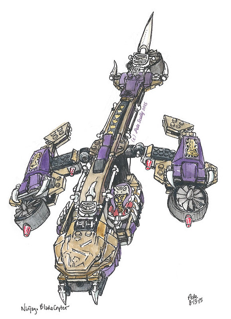
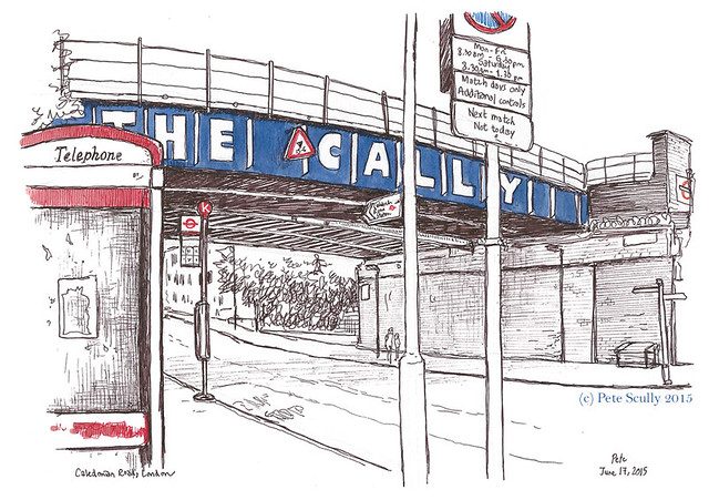
This is Caledonian Road in north London, more commonly known as The Cally. It’s been called the Cally for ever, but they felt it necessary to write it in big bold letters on the railway bridge in case people forgot. The Cally is not the area of London where I am from (I grew up in Burnt Oak), but is very much my Dad’s manor. He grew up around here, living up the near the Nag’s Head in Holloway. When I was a kid my dad would occasionally drive me over here when he had to visit his mates or my uncles, who still live locally. I remember him driving his Citroen full speed around narrow streets, shouting the ‘occasional’ swear word, his tools rattling around the back of the car. I was always scared of this area to be honest, it seemed a lot more dangerous than my neighbourhood (and I’m from Burnt Oak!), so even as an adult I never came down the Cally, except passing through on the bus from Crouch End, where I lived before moving to California. My dad moved from here in the 70s, and I knew several other friends in Burnt Oak whose mums or dads had ’emigrated’ from Holloway. This is still a pretty rough area, despite the trend of Islington gentrification. A couple of months ago though I had to come here for a meeting with a publisher (news very soon!), and so I just had to sketch the place. Actually, I think this would be a very interesting place for a sketchcrawl.

HM Pentonville prison
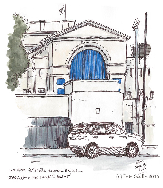
This is HM Prison Pentonville, the ‘big house’ which casts an imposing presence over Caledonian Road. Pentonville was opened in 1842 and has had many famous residents, such as Éamon de Valera, Dr. Crippen, John Christie (and Timothy Evans who was wrongly hanged for Christie’s crimes), Oscar Wilde, and George Michael. I sketched it from a cafe across the road called, appropriately, the Breakout. Condemned inmates were executed here at Pentonville until 1961. Prisons are horrible places.
Blundell St, London

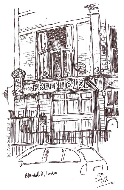
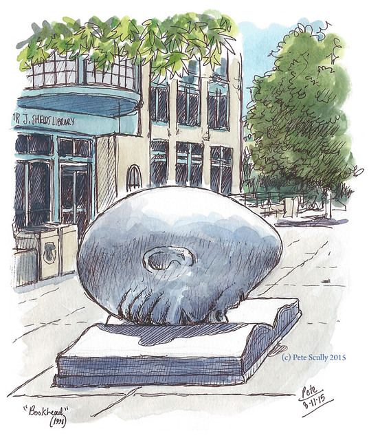
From the Jail house to the Free House…this is actually at the back of the Breakout Cafe, which looks like it was built in the space of a closed-down pub. This is part of the old pub signage around the corner from the Cally on Blundell Street. My dad actually went to school on this street, though the school is long gone. I wanted to colour this in, but left it as it is.

Queens Head pub, Kings Cross

Now this last one, my pedigree chum, is not on Caledonian Road or even anywhere near it but I’m including it anyway, because it was my last sketch of the day (and of my trip to London, unexpectedly). I got a bus  that went all the way down the Cally to King’s Cross, because I still had some of the afternoon left to kill (actually to sketch, just sketching, no killing goin’ ‘ere guv). I was going to meet my mate down in Farringdon for a beer before we were meeting another mate later for another beer. It was an ‘ot summer’s day in London. Rather than get the bus the whole way I stopped in King’s Cross, thinking, oh I’ll just draw St. Pancras, no biggie. Piece of piss. There was definitely a lot of that about. After ignoring a very drunk woman shouting “Oi! Chris Evans!” at me I picked a spot opposite the magnificent St. Pancras International Station and decided actually, no, this is too big and too complicated, and life is too short to stand around King’s Cross drawing the same window over and over again until your hand hurts. Sorry St. Pancras, some other time perhaps. I wandered in a vague southwards direction (the back streets of this part of town are a little uncharted to me), and sketched this pub, the Queen’s Head, on the way. As you can see, I miscalculated the length of the sign when writing the pub’s name in there and so the word ‘Head’ is squashed up, and this is something I pretty much never do. At the end of a trip full of complicated and pretty well-thought-out sketches, I took this as a sign to say, yeah let’s call it a day, and go and have a beer. Until next time, London, until next time!