NEWCASTLE UNITED 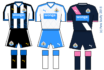
Newcastle have been very unloved lately, even by their own fans. It’s the owner. The past couple of seasons it has seemed they were trying to create the most apathetic team in history (though overpaid apathy is all too common in modern football). This un-Newcastle-ness has been spreading into the kits, with the much-hated Wonga sponsorship, and this season’s home kit, which features far too much blue. The famous black stripes actually turn blue as they move south, and the reverse of the short is plain white with blue accents, no magpie black at all. I don’t mind a blue trim on Newcastle (think the blue star, or their Asics kits from 1993) but this feels like too much. I’d love for Newcastle to get a different owner and come back with a massive roar, but it isn’t going to happen in this kit. The white away kit is handy if they face any teams who play at home in black (which is exactly none) while the third kit features half a salmon pink sash. |
SUNDERLAND
Both Tyne/Wear teams are in the Premier League, what a joyous time to support a club in the northeast oh never mind. Sunderland were pretty pitiful last year (how on earth did they and Newcastle both stay up?) and so far this season have looked deeply uninterested to the point where the manager Dick Advocaat said all the players are for sale. I have to say though, their home kit is pretty snappy this season. Wider stripes look good on Sunderland (though I’d love a return to the super-thin 80s stripes), and it is a smart cut. The away kit is green, green and green. Green is very popular for an change colour this year. By the way, I think both Newcastle and Sunderland will stay up again, because no matter how little they try, there’s always someone a bit more rubbish. |
ASTON VILLA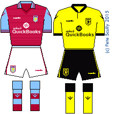
Which brings us on to Aston Villa, who are always a bit more rubbish. Yet paradoxically, no matter how awful they are, they never seem to get relegated, ever. Sherwood arrived to fire them up last season and they stayed alive, but already this year they look like they will run out of ideas fast (they’re above Spurs at the time of writing though…). Their kit supplier, however, will not. I like Macron kits, they’re always a bit more original, and Villa’s kit is sweet, with a collar reminiscent of the 1970s. The away kit is clean, and I’m always a fan of Villa’s yellow away kits (I like most yellow away kits, in fact) (did you know, for example, that Tottenham’s yellow change kit tradition stems from the fact that they had to ditch their usual navy kits when the it was deemed too close to the black shirts of referees? It’s why black kits were so rare until the Premier League era, when refs started wearing green, followed by other colours; Man United started the modern black kit trend in the English top flight in 1993-94, and many, many others followed, while yellow kits have been seen more rarely, only once every few years now at Spurs). Villa’s traditional away colour, incidentally, is white. |
BOURNEMOUTH
Oh sorry, I was doing Premier League clubs, I’ll get rid of this one.
What? Bournemouth are in the Premier League? BOURNEMOUTH? How did this happen? Well, they damn well earned it, that’s how. Eddie Howe, in fact, their brilliant young manager, created a free-scoring team that topped what was a very difficult Championship (what a season last year was! More interesting than the Premier League by a long way). I hope they do well, and hope they stay up. We’ve had some teams that joined the Premier League over the years that were pretty gobsmacking additions but did reasonably well for a while (Fulham, Barnsley, Wigan, Reading, Swansea) (by the way, how good are Swansea this year?!) but none have suprised me as much as Bournemouth. Ok, enough gushing, their residents have to be in bed early. The kits are nice, black and red stripes being the Cherries’ modern tradition since the 90s (though they had them for a while in the 70s), and there’s the Mansion sponsor again. The blue away kit is alright, while the pink will really stand out – less Cherry, more Strawberry Milkshake. |
WATFORD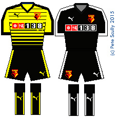
I remember when John Barnes was young, Graham and Elton having so much fun, playing cup finals and wearing red shorts…I can only go so far with this. I’m so glad Watford are back in the Premier League. I grew up roughly halfway between Watford and Tottenham, so have always had an affinity for the Hornets not as a second team exactly, but because I’ve known a few Watford fans, and they are a lot nicer than Arsenal, Chelsea and QPR fans. So, they’re back, and yeah, it isn’t going to last, and they may go through a few managers, but they have a very nominative-deterministic home kit. They are the Hornets, you see. Oh and they have a red stag as their badge. Black shorts is the tradition, but I like red shorts on them, because it reminds me of the glory days of the 80s. The away kit is all black. They are also sponsored by a betting company – do you notice that more teams in the ‘lower half’ as it were have sponsorship by betting companies? I’m sure there’s no correlation, and betting companies don’t hold the game in its sway or anything. Newcastle are sponsored by loan sharks, while Villa are sponsored by accounting software, and Norwich by an insurance company. Money money money. |
NORWICH CITY
I love Norwich, because I have family up there. but I also like their kits when they are made by Errea. Errea make smart designs in the Italian fashion, and this year’s Norwich kit is interesting, bringing more green in to make halves. IT uses up all the green and yellow at the cliub though surely…oh no, the away kit is green with yellow pinstripes. Ok, maybe the home kit feels more yellow, so this is sensible, you know, it will look good against Watford, or Sweden, but in the unlikely event of playing the Nantes team of 1995, they must have a third kit that is blue or white or OH WOW. Ok, um, the third kit is yellow and green. And gold? With black shorts. Right. Er…it does actually look fantastic. No seriously, I LOVE this kit. Norwich and Errea have done it again. This kit reminds me of the style worn in the 1870s by those early teams such as Wanderers or Royal Engineers, or later teams like Bradford Park Avenue. |
…and an honourable mention for:
OXFORD UNITED (LEAGUE TWO)
Oxford aren’t in the Premier League, don’t worry. That would be as ridiculous as saying Bournemouth were in the Premier League! (Hang on…) But their kit this season gets an honourable mention because it harkens back to the mid 1980s, when Oxford were not only in the old First Division (hey kids, that’s what we used to call the Premier League) but were actually a pretty decent team, even winning the Milk Cup (hey kids, that’s what we used to call the, um, er, what is the League Cup called nowadays?) John Aldridge played for them, so did Ray Houghton, in fact you might say the Oxford of 1986 beat the Italy of 1994. Dean Saunders played for Oxford in the 80s too, and Malcolm Shotton, er, Trevor Hebbard, you know, the list goes on. This season’s home shirt is made in-house and resembles that 1985-86 kit, which was made by Umbro. They’ve been promoting it with an 80s-style Subbuteo theme. The red and black away kit is a throwback to an away kit worn in the mid 1990s when they got promoted from the old Division Two to the old Division One. Yeah, those past glories. |


Ow