The third and final kit review of the Euros. I should have done one for the Copa America too (Columbia’s home kit is now white?) but it took me a little by surprise. We are at the end of the Group Stages now and the worst teams are starting to pack up and go home, while the teams coming third in their groups are waiting to see whether they will be one of the four best-placed third-placed teams out of six, causing heads to implode trying to figure out the permutations and arrangements. Albania for example might yet go home if other teams are deemed to have done better. In the case of teams having identical records, it goes down to goals scored, goals against, coefficient, length of beards, number of supporters arrested (outside the ground against inside the ground), and if they are still tied after all of that then Cristiano Ronaldo gets to judge how much of a “big country” or “small country” mentality a team has. It’s a complicated system. I still think it should all come down to kit design. On that note, let’s crack on with the final two groups: E and F.
GROUP E
REPUBLIC OF IRELAND
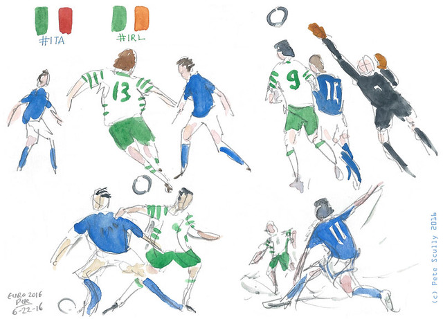
 My team. Well, them and Northern Ireland. And England I suppose, though I’ve a soft spot for Wales, etc. Gone are the days however when I knew the names of all the players – Tony Cascarino, John Aldridge, Pat Bonner, Ray Houghton, you know, Phil Babb, all those guys. Now, I know Robbie Keane, and all the other guys. The same to be honest can be said of any team, international or club, except of course for Spurs, even though I watch football all the time, read football magazines and collect football sticker albums. “I Am Forty”. I do have a lot of Ireland shirts though, dating back to the USA 94 kit (the special jersey my mum got me commemorating Ireland beating England in 1988 doesn’t really count, I doesn’t fit any more too). My favourite is the last one, more of an old rugby shirt style, and this new one does something similar, but is a little less to my liking, although the orange trim is quite tastefully minimal. It’s still a much nicer shirt than, for example, the Northern Ireland home shirt. The away is alright, the little stripes on the arm look like something someone suggested and then looked at it afterwards and said, “meh, but who cares”. Now the Irish started well, being unlucky to only get a draw out of the Sweden game, but they got utterly tonked by Belgium. Yeah, we may not beat Italy in the last game but you never know. I still have a t-shirt celebrating “beating Italian ass on American grass” in 1994. Come on Ireland!
ITALY
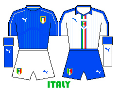 Italy have started well, couple of decent wins. They defend well, have a good manager in Conte (Chelsea-bound), and the best national anthem of all, probably. The kit is decent as well, simple effort, unfussy (they like the word ‘fussy’ these football kit describers, “it’s a bit of a fussy design” they say, to make themselves sound like real fashion and design afficionados) (I like “unfussy” because it’s not really a word; well it wasn’t, but I suppose it is now). Italy don’t have the superstars of old (well, they still do, like Buffon, but they are actually old) (Buffon by the way, the legendary goalkeeper, is my man-crush, he’s a handsome chap is Gigi). I like Italy but I need to explore a bit more of it, I’ve been to Venice three times but that’s really it. On the third time in Venice, I got engaged to my wife. Happy memories! Italy – the Azzurri – wear blue because that was the colour of the royal house of Savoy, and boy do they wear it well. The traditional white away kit has the Italian flag running down the middle.
SWEDEN
 Sweden is all about Zlatan. It shouldn’t be, but it is. He rolls around the pitch being a genius looking frustrated that the rest of his team aren’t all Zlatans, but if the were all Zlatans then he would not be Zlatan. Zlatan has what you might describe as a rather large ego. In fact it’s better to just zlatan the way Zlatan does. This zlatan is the latest zlatan to come from Zlatidas and features three zlatans down the zlatan and a slightly more zlatan shade of zlatan. The away zlatan is zlataning, with its zlatanesque zlatans. In the first zlatan, Zlatan were zlatan to get a zlatan against the Republic of Zlatan who I felt zlataned the whole zlatan, though Zlatan did zlatan the zlatan the zlataned the Zlat defender to zlatan an own-zlatan. Ok Zlat’s enough of Zlat. I do like an Adidas Sweden kit, thinking back to the great Swedish side of the early 90s (or “BZ” as Zlatstorians prefer to number those years), Tomas Brolin and co. This one is lovely. Shame you won’t see much more of it this summer.
BELGIUM
 Ladies and gentlemen, we have a winner. This is my favourite kit of the Euros. I have a soft spot for Belgium having lived there for a year back in 1999-2000 (I lived right across the street from the stadium in Charleroi where England played Germany, remember that one, fans of chair-throwing and water-cannons? I’ve wanted a Belgian shirt for a long time and they have had so many duffers (those Burrda ones for example) but I think I will stump for this one. The yellow is a more day-glo shade and the black on the chest really offsets that red. I can imagine wearing this while wandering the streets of Brussels with a sketchbook. The away shirt is nice too, reminds me of a cycling jersey, since the sport of cycling is very popular in Belgium. That year I spent there was very formative in many ways for me, though I could have been more creative with my time, I felt I didn’t get a lot done. I had a guitar and wrote some songs, I did a lot of personal writing but very little concrete stuff of substance, I drew a little bit but not that much, and I didn’t know many people so would just go to the chip shop and then to the local pub with the other locals, but looking back I think all of this was a life-long inspiration of as-yet-unformed ideas. Maybe I was just lazy. I would go up to Brussels and spend the whole day going around the city on the streetcar reading novels, then go to see a movie, go for a beer, and get lost on the Belgian train system trying to get home. And then there is the rain, the endless, constant rain. I think of all of this when I see that Belgian football badge, and I’m glad I got to know the place for that one year. As for the football team, I like them because they have a few of the best Spurs players on the team, though I’m not a fan of their goalie Thibault Courtois, because he a) plays for Chelsea and b) looks like the Republican speaker Paul Ryan.
GROUP F
AUSTRIA
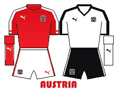 Okay, I am drifting in these reviews a little, lets get back to the kits. Austria have a standard enough Puma kit, which is red because a few years ago when they co-hosted the Euros with Switzerland, who also wear red Puma kits. Austria used to wear white withblack shorts, so when they turned up to the party wearing EXACTLY THE SAME BLOODY CLOTHES AS SWITZERLAND, the Swiss just facepalmed at their neighbours, oh you are so embarrassing. Oh right, next you are going to copy the whole mountains, watches and cuckoo clocks thing too aren’t you. Well this time, they still wear red but their away kit looks decidedly more like traditional Austria (which was itself, er, very similar to Germany). I first went to Austria in 1991 with my German class from school, spending two weeks with a family in Vorarlberg. When I was a kid I had a pen-pal from Vienna, and was always so impressed at Austrian handwriting. European handwriting is generally much nicer looking than messy English handwriting; French might be the best, but I like German too. Here I go again, talking about handwriting, completely unrelated to the football shirts. Let’s hope these Puma kits don’t rip easily like the Swiss ones in that game against France – four of the shirts had massive holes torn into them, prompting hilarious jokes about Swiss Cheese. Austria had been quietly fancied before these Euros, but it looks like they will be dropping out very soon.
HUNGARY
 Right, so Austria vs Hungary conjured up images of the old Habsburg Empire, and it was all, oh yeah. Back in the 1920s Austria had the ‘Wunderteam’ (which roughly means “wonder team”), but in the 1950s, Hungary truly were the wonder team. How they managed to not win the World Cup in 1954 is a mystery matched by Holland not winning it in 1974 or 1978. The team of Puskas, the Mighty Magyars, famously destroyed England at Wembley in 1953, dubbed the Match of the Century. They will always have a legendary history. In modern times Hungary have been decidedly more shit. Come on, they have. Which is why it’s so exciting that they are back in the big time now, and they’ve done alright so far, beating Austria, and managing a draw with, er, Iceland. The kit, classic colour combo, and an Adidas template which is two years old (tsk, living in the past). I had some great Hungarian friends when I was younger, back in London. Another friend of mine (who is English and an actor) goes to Budapest several times a year, as it’s a common place for TV and film production.
ICELAND
 Now this really is a surprise. Iceland? The land of actual ice? They qualified ahead of the Netherlands. Holland! The Dutch! Iceland are I suppose our substitute for not having Scotland there, it’s kind of close enough. They have a fairly recent history of football, and some famed Icelanders have become Premier League stars (Eidur Gudjohnson, Gylfi Sigurdsson). Everyone loves Iceland (except Cristiano Ronaldo). Of course, I’ve liked them since they were called Bejam. Alright you won’t get that one if you’re not British. Basically there is a chain of food stores, predominantly frozen food, and they also sell fridges and freezers, and they are called Iceland; well they used to be called Bejam before changing their name. It was a bit like Snickers used to be Marathon. I actually spent a day delivering fridge-freezers for Iceland with my brother-in-law around Hampshire a couple of decades ago. None of this is relevant of course. The kit here is made by Italian company Errea, I always like their designs though this one is kind of okay. In years to come it will be an Icelandic classic. Will Iceland go through to round two? Probably. I hope so. Their away kit is very similar to the one worn by the Allied POW team from Escape to Victory. I hope their goalkeeper is better than Sylvester Stallone.
PORTUGAL
 This is the age of the one-superstar-dominating-the-team. When I say that I don’t mean the 2010s, I mean the past century or so. For Sweden it is now Zlatan. For Portugal, who have always had a lot of great players, the main man is, well you know who it is. He has a great freekick record at major tournaments – 36 taken, none scored.He added to this in the recent 0-0 against Austria, even missing a penalty to boot. I imagine he is the sort of person to invite his friends over to watch him play video games, declining to let them actually play because it wouldn’t be fair, he’d just win against them. But whenever Messi calls and asks for a quick round of MarioKart he always pretends to be washing his hair (haha, “pretends”). Portugal won’t win it; maybe after he retires.The kit is alright, another Nike Vapor template, with the different colour socks thing Nike are playing with like they bloody invented it. The away kit is a garishly ugly greeny-teal colour I just can’t understand. Ok fine it’s “interesting”. It was probably his idea, you-know-who. No not Voldemort. I went to Portugal in 2011 for the urban sketching symposium and had a lovely time in Lisbon, eating sardines and drawing fire hydrants.
And that is all you get. This was possibly the most rambly post I have ever done so if you have made it this far, thanks for just scrolling to the end, now go back and actually read it properly please. There will be a test later. Anyway, back to the actual footy.


 Whenever there is a major football tournament, you usually start out by giving the trophy to Germany by default and then coming up with compelling reasons why they shouldn’t win it. If you can’t think of any, Germany get the trophy. That’s how football actually works. Gary Lineker famously said that football was “a simple game: twenty-two men chase a ball for 90 minutes and at the end, the Germans always win.” I’m pretty sure he meant 120 minutes plus penalties. Will they win Euro 2016? Ich weiss nicht. However, the kit is CLASSIC GERMANY, none of the nonsense white shorts and red chevrons seen in the last World Cup. Simple, except for the stupid big gold World Cup shield in the middle (FIFA, is there a more tasteful way of saying “We Are The Champions, Mein Freund?”). It looks lovely and if they won in this kit they’d deserve it. Right. The away kit. Ach du lieber Gott, was ist das? Ok I like Germany to have a green away kit, tradition. But this thing is just nonsense. The dummkopfest thing about it? It is reversible. Ah, that’s brilliant I hear you say, wunderbar, but the inside is lime green and meant to resemble a training pinny. Just, why? That idea is just the wurst.
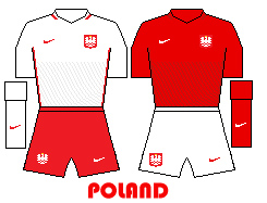 Remember the last Euros, held jointly in Poland and Ukraine? Poland didn’t do so well. They went out in Round 1. They don’t have the pressure of being the hosts this time so might do better. So far they have drawn with Germany, and narrowly beaten Northern Ireland. Also this time you can come third and still get through so they are probably ok. They do have a superstar striker in Robert Lewandowski who is destined to be like all the other star strikers in these Euros and score nothing at all. The kit is a basic Nike template (“Vapor” as Nike calls it; “Vapid” would be more appropriate) though if you look very closely you can see little curvy lines meant to represent historical Polish Winged Hussars, because obviously. Nike shirts by the way are made from 16 recycled plastic bottles, because of course. That will be $90 please. The away kit is just like the home kit but red. I’ve been to Poland, Krakow to be precise. Some skinheads stole my glasses (I got them back though). I’d like to go and sketch Gdansk some day.
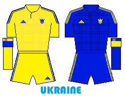 Remember the last Euros, held jointly in Poland and Ukraine? Ukraine did marginally better than Poland but still went out in Round One. Their kit had a nice traditional Ukrainian pattern on it. This time is features a strange yellow plaid pattern that I assume is a tribute to Rupert Bear’s yellow tartan trousers. Rupert (I’m guessing) is probably hugely popular in Ukraine along with his friends Bill Badger and that elephant one I always forget. Edward Trunk, that’s it. I used to get the Rupert annual every Christmas, I loved Rupert. I even loved the Frog Song by Paul McCartney, I watched that video over and over when I was 9. I hope they play that at one of Ukraine’s games, “We all…stand…together (bom bom!)” So far, Ukraine have been pretty awful, losing their first two games 2-0, being eliminated already. They still have to play one more game – against their old co-hosts Poland, who will probably be qualifying for the next round by then. They might roll out that blue kit for that game. The blue tartan kit by the way is I assume a tribute to the Scotland team, to be worn when going out of competitions early.
 I’ve waited so long for this!!! Since Mexico 1986, to be precise, when I was ten. Since then I have of course followed the Republic’s rise in football stature; my family is from both sides of Ireland, so I root for them both, and I’m overjoyed that both made it to France 2016. Northern Ireland qualified in style, topping their group. As for the kit, well…I do like when Northern Ireland adds a bit of dark blue into their designs (a reminder of St.Patrick’s Blue, the original colours of the Irish national team back in the Olden Days) and it distinguishes them more from the kit of the Republic but this kit is, um, divisive. Not for any political reason, I mean it’s just not that good of a shirt design. When it came out petitions were formed to get it changed to something more reminiscent of the great ’82 and ’86 World Cup teams, but to no avail. You might think that strange band across the middle looks sort of stylish, but it isn’t. The team of course are not fashionable anyway, and they don’t mind that. The away kit is alright, something about a simple white Northern Irish shirt that has a classic feel to it; they have messed about with it a lot in recent years. They have won a game already though, beating Ukraine 2-0, and who knows – they may just get a result against the Germans. I certainly hope so!
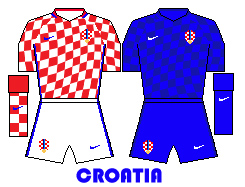 I love Croatia’s unique home shirts, but this time they will very likely wear all blue in every game. So, UEFA, here is an idea. Tell teams to release their kits after the draw has been made for the Euros. Then, if any team is in a group with Croatia, they should refrain from having a red shirt when their home is white, or a white shirt when their home is red, but go for something that doesn’t clash with red and white shirts. Blue, or green, or black or yellow or turquoise (ahem, UEFA, Turkey did actually do that). That way, Croatia can actually wear their home kit without confusing your already confused referees. Because as a fan of Croatia’s unique home shirt design, made so famous in Euro 96 and World Cup 98, I want to see it on show. Okay, Euro 2012 they did wear it twice. Alright, they wore a lot it in the 2014 World Cup too. But in Euro 2008 it was blue only, and this time around it looks like the same will happen. The current iteration of the famous red and white chessboard is made to look like a flag flying in the breeze, which by the way Nike is really hard to draw in MS Paint, thanks for that, so I had to take the checkers and distort them in Photoshop. It’s not entirely accurate but you get the general idea. I’ve never been to Croatia, but it’s been on my list of Places I’ll Get To Eventually since I was a kid in the 80s, when my sister was a travel agent for Lunn Poly and I would read the “Yugotours” brochures at her work. “Why don’t Yugo someday?” I would say to anyway who would listen like it was the funniest thing in the world. Hey it was better than the Lunn Poly “Get Away!” adverts that used to be on TV all the time.
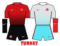 Turkey usually go for a nice safe kit design, a bit like Poland, not doing too much out of the ordinary, so when I saw this one it was like WHOAH BABY, what the? The home kit is red but with black diagonal criss-crossing lines that get thicker as they go down the shirt. Really quite difficult to pull off in MS Paint – I spent a very long time trying to do it – so in the end just took the pattern into Photoshop and added a gradient over the top, before bringing it back into Paint. Black shorts and socks! Albania are looking at this and doing the Muttley grumble, “rinkumshinkunrurkey!” It looks damn fine. And then there is the away kit! Same design but white and turquoise, with for some reason red socks. It’s pretty lovely, very calming. So the Turkey team, will they do well? Probably not. They have lost their first two games and will probably not stick around much longer. Shame, because if it comes to a tie-breaker and kit design is a deciding factor, I reckon they’d do alright. Also they are looking good for the beardiest team of the tournament (though Joe Ledley of Wales is winning that particular honour all by himself). I should do a guide to facial hair of Euro 2016, and then another dedicated to players’ actual barnets too. If any of you have the Panini sticker album, check out the obviously-some-sort-of-disguise of Olkay Sahan. Definitely expect him to pull that off at some point in a game, whip out a microphone and turn into the ghost of Jeremy Beadle, strolling about the pitch.
 I like it when the Czechs have red shirts, white shorts and blue socks. But oh no, they had to do an all-red number, and have weird pointy-down chevron things splashing down the middle pointing down at their shorts for some completely innocent reason. Well, there are no other kits quite like it in these Euros, so that’s something. The away kit is standard Puma fare, white with that blue that was missing from the home kit. Yawn. I’ve been the the Czech Republic twice, just to Prague, both in my early 20s which involved a lot of cheap beer (“pivo”) and a few cheap hostels too. Me and my mate Tel went there for the best part of a fortnight. I wanted to look at old buildings and bridges; he wanted to look for video stores. We took the old overnight Eurolines bus there and back, this was right before cheap airlines really took off. I still have a small mug that I bought there with a little drawing of a man lying down being all happy and stuff. The naivety of youth.
 And finally, from one set of favourites Germany to the other set, Spain, reigning European champions, and looking for a three-in-a-row victory. In the last World Cup Spain had a horrifying all-red kit which thankfully led to them being knocked out early before it could do more damage to my sensitive disposition, but this time they are back with what I must say is one of their best ever kit designs. Red with yellow trim (Adidas stripes under the arms this time, I like it), proper blue shorts, and black socks (well, very very very dark blue). As it should be. I am happy. Adidas, you are knocking it out of the park this year. And then there is the away kit…I sense the room go quiet, people pausing at their drinks and looking over nervously, and I slowly start to smile, and nod my approval, and the whole room erupts in celebration. What a crazy and beautiful kit! All those triangles, all those bits of yellow and red, it looks a bit like one they had 20-odd years ago but put into a blender. I love it. I enjoyed making this one. I was ten when I first went to Spain on a family holiday. It was to Ibiza, the Mexico 86 World Cup was on, I remember going by myself to a local restaurant (while my family were either at the pool or a nearby pub, the Snooty Fox I believe it was called) to watch a game and eat beans on toast. As for the team, they have started in style, qualifying for the second phase after two wins. Spain are back!

