october or not-tober, that is the question

orange court
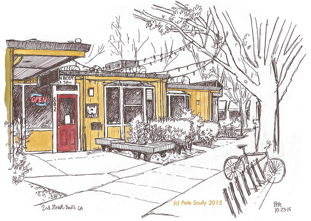
Orange you glad it’s the weekend? Actually it’s Monday now so very much not the weekend, very much Monday. But it was still the weekend when I drew this, and what a nice time to have a weekend, at the end of a ridiculously busy week. Those are the best. On Sunday I had actually nothing to do, nothing that couldn’t wait, so I spent the afternoon downtown with my sketchbook. The night before there had been a tremendous thunderstorm over Davis, one which had knocked our power out for a couple of hours. There was so much lightning that we didn’t really need candles. The rain was much needed though, and gave everything a fresh autumnal feel the next day. It was bright and breezy, still warm but not hot like it has been, and I decided to return to Orange Court, a good spot for practicing perspective. That by the way was the reason behind the ‘Orange’ joke. Straight ahead of me is Sophia’s Thai Kitchen, let’s face it one of my favourite spots in Davis. Their food is amazing. I was sat on the decking in the shade beneath a tree, and there were loads of little green bugs and ants crawling and flitting all around me. I did most of the colour there on site, but those bugs got the better of me so I retreated to a comfy seat in De Vere’s Irish pub, a block away, to finish off the rest. I have been doing precious little proper urban sketching lately, but this month I will start ramping it up again. “Inktober”? I’m not going for faddy fads, though I might do one of the lesser known ones, this month is full of them. “Thinktober” I could do though, where you spend all month thinking about doing stuff but don’t actually do them. “Octobler”, where you just eat Toblerone. “Mocktober” where you make fun of everything. “Etctober”, and so on.

beer we go

univ of beer, davis
I am back! I have been busy. I have more busy to be busy about but that is coming. In the meantime here is a sketch I did a couple of weeks ago at the University of Beer on 3rd Street in Davis. I had just sold a couple of sketches at the Pence Gallery’s annual Art Auction (hooray! Thanks for buying them!) and was in the middle of a very busy period of history, so an evening at the pub trying a few new different beers was in order. Not my greatest bar sketch but I enjoyed drawing it. It was a strange night in downtown Davis though. The evening before a man was tragically killed in an altercation at another bar about a block away, which has since prompted the City Council to impose a 45-day moratorium on all new bar and restaurant development / expansion. The downtown Davis area has been becoming a lot busier at night in recent years, but Davis as a city is growing, and becoming more of a destination. Being before the UC Davis school year officially began, it wasn’t particularly busy on this Saturday night so was quite a pleasant evening, which I followed by the long walk home. I’m not a fan of the walk through the too-dark streets of Old North Davis, which are poorly lit because ‘residential’ but I always think a better lit street is a lot safer than one where you can’t see the person about to jump you. They say, “well we want to be able to see the stars” but forgive me if I’m wrong, the streets between fifth and eighth aren’t full of budding astronomers every night. Oak Street is the worst, the road I cycle up after work, in the winter months when it’s dark early it is complete pitch darkness. Ah well, at least on this night as I strolled back to my bed I had the internal glow of four and a half craft beers to light my way. This was the first spread of a new sketchbook, another Seawhite of Brighton one, which I’m hoping to fill quickly…

do the maths

MSB panorama pen full 2015 sm
This is my – oh hang on, wait a minute. Today is “International Talk Like A Pirate Day”. Right, I’ll start again.

Yarr, this be the ol’ Mathematical Sciences Buildin’, yaaarrr, this be where I be workin’ each day. Click on the ol’ picture to see it bigger, yarr, or be usin’ a telescope, me old shipmate. So aye, yarr, ye lily-livered-landlubbers, I be drawin’ this oh I can’t keep this up. Talking like a pirate is not easy you know. When I went to the Swashbuckler’s Ball a couple of yarrs ago (did you see what I did there? Did you see that?) someone said I did a really good pirate voice, but I wasn’t doing one, I be just talkin’ normally. Anyway, if for some reason you were unable to translate my piratespeak (and if you weren’t, shame on you. Like the old saying goes, “fail to translate my piratespeak once, shame on me. Fail to translate my piratespeak twice, er, er, I won’t get fooled again.”) Ok, where was I? Ok, so, this is the building where I work. It’s called the Mathematical Sciences Building, or “Math” Sciences Building, as some people call it. Or “Maths Sciences Building” as I sometimes call it. Ok so for those who don’t know, in America they say “Math” but in Britain we say “Maths”. We also say “Mathematics”, and so do Americans, and let me tell you they don’t like it when pretend to assume they say “Mathematic”. They definitely don’t say “Mathematic”. “Mathsematic” is right out, don’t ever say that. Anyway…this is where I work, it was built almost ten years ago and I’ve worked there for most of that time. It’s a nice building, though the elevators are very slow. I drew this to use for work (I like to have a few sketches of the building to use for various things) and I will do a colour version to, but I wanted to highlight our brand new sign which was installed a month or so ago. On either side is a different symbol, one for Mathematics and one for Statistics. It’s been years in the making so it’s very exciting. Many UC Davis buildings have been getting modern new signs, as part of the campus branding process, which has been (for me) very exciting to watch develop over the past decade. So anyway, I haven’t drawn the MSB (that’s what I really call it) for a few years so here we are.

this is ink land

pens sept 2015 sm
These are my pens. These are not all of my pens. These are some of my pens. I like the Uni-Ball Signo UM-151 pen, and I order them from Jetpens. The one I use the most is on the left, the brown-black version. I go through a lot of these. They don’t run with a watercolour wash (unlike the black one, which does). The coloured ones are fun to have too. For thsoe who don’t know I colour in using watercolour paints. There are a couple of other pens in this picture, one is the Pigma Graphic (a thick-lined version of the Pigma Micron), the white gel Uni-ball Signo (this has a very prominent white gel that shows up on even very dark surfaces, unlike a lot of white gel pens), and the black one is the Pentel 04 which is not quite as nice as the Uni-Ball Signo UM-151 but is still pretty good. Oh, and there’s my trusty H2 pencil. Tools of the trade. Hey if you are interested in what materials I generally use when sketching, I have recently updated my long-in-need-of-updating Materials page. Hope you like it!

the plastic people of the universe

As you may have gathered I like to draw my son’s toys, especially his Lego, but many of his other things too. This is all in a book, a Stillman and Birn Alpha book, and is primarily as a keepsake for the future. When he’s grown up, he’ll be able to look through these and remember his toys, and he’ll probably say “Dad, can I borrow those back now please, Dad why do you have an entire basement full of Lego, Dad you’ve been drawing Lego continuously without sleep for twelve years ” and so on. Well, here are some more.

Lego figures again

ABOVE: Ok…we have Ka-Pow (I think), Ultron, Nevula, Morro, Wolverine, Jay the Blue Ninja, Lavel, Sensei Wu, Falcon, a Nindroid, Lloyd the Green Ninja, Wonder Woman, Star-Lord, the Flash, a Sormtrooper, Ant-Man (Scott Lang), Luke Skywalker, Captain america (right there two of my favourite heroes), Skylor the Orange Ninja (but she’s yellow, right? Mustard Yellow at least but my son insists she ‘s the Orange Ninja), Krusty the Klown (that’s mine!), Red Skull, Cyclops and the Emperor. Phew!

Lego figures still yet again

ABOVE: So…Kai the Red Ninja in his Airjitsu outfit, Scralet Witch, Han Solo, Taskmaster, Catwoman, Imperial Guard, Iron Man Mark 6, er…the king of the Lion tribe in Chima…Batman, one of the Chima Phoenix tribe, Cole the Black Ninja, Zane the White Ninja (actually maybe the Titanium Ninja by this point), Pepper Potts, Tony Stark, Lasha, Superman, Miles Morales Spider-Man, Master Chen, Wyldstyle, Deadpool, Clone pilot, Storm, Nova Officer.

Lego figures yet again

ABOVE: Finally…Yellowjacket, a Chima lion, a knight, a Sandtrooper, Aquaman, Lloyd (Ninjago Season 5), Kai (Ninjago Season 1), an Ogre, Magneto (white gloves era, probably when headmaster of the Xavier School), a Skeleton, Modok, a Battle Droid, Nya as the Water Ninja, an X-Wing pilot, a Season 5 Ninjago Ghost, Rocket Raccoon, Thor, Lex Luthor, a Knight, a Chitauri and…snow-suit Batman. Because what makes more sense than Batman wearing white and light grey.

Have you seen the Lego movie? It’s brilliant, it’s awesome, and I love that guy at the end, I presume he is the hero, the dad character who has that big Lego city. He’s living the dream. We do between us now have a lot of Lego, so when I say I am drawing his Lego, I really mean “and mine too”. But right now, Lego mini-figures are the number one play-thing. We get the big sets, but really it’s all about the figures that come with them more than the big vehicles. Right now, Ninjago and Chima rule the roost. Marvel, DC and Star Wars get in there but I don’t let him mix them up (just to wind me up, he puts Venom’s face into Taskmaster’s hood). Now I have drawn a bunch before, but I felt it was time to draw some more. And then some more, and then some more because I just can’t stop. I can’t Lego of the pen (really Pete, really???). Of course I should have drawn them as the majority really are, ie all taken apart and scattered across the floor, but I’m a puritanical President Business wannabe aren’t I, so I drew them as nature intended. Or at least as best I could gather them up. And there are loads more. Let me tell you something though – this took AGES. Absolutely ages. I’m not kidding. Half the time was spent looking through all the Lego for the right figures! Matching up the ones that were in pieces, trying to make sure there was a fair amount of female representation (not easy in Lego-world) (and I’ve noticed that female figures all have these little curves painted into their midfriffs). Finding the right weapons (I’m sure I got a few wrong, my son’ll be the first to tell me). Drawing them all one by one, and then colouring them in with watercolour, oh man that was a long process, I never want to do this again. I will of course, when there are more to add to the “draw-all-my-son’s-things” log. But it was hard work my friend, hard work.

chair today, gone tomorrow

frank's chair
One of our long-term and much beloved professors retired recently, and so has been relocating from his office. Professor Samaniego had a few really old and interesting chairs, sat on by many students over the decades, which I have been talking about sketching for years, and now they are finally leaving I had one last chance to draw this one, which is probably my favourite. It’s an old seat from a theatre, a very posh theatre too by the look of it. It has the letters “GR” cast in iron on the decoration, and beneath the seat is a rack specially for storing top hats. I wonder what performances this chair witnessed over the years. With the wooden slats beneath it, it looks like it is a chair on skis. I didn’t have room for it in my office, unfortunately, so it will be living with my boss. Au revoir, nice old chair!

on a street

A & Rice, DavisThis is on A Street, in Davis. Sorry, not ‘a street’, but “A” Street. It’s named after the letter “A”, in recognition of all the Amazing words A has given us, like “Aardvark”, “Apple”, “A”, “An”, “And”, “Abba”, all the A words. I sketched this at lunchtime today, the weather was ever so slightly cooler and more bearable, and I didn’t want to eat food. If I had been hungry this might have made me hungrier, for this is on the corner of A Street and Rice Lane. Rice Lane, of course, named after Rice, the food, in recognition of all the Amazing foods rice has given us, like “Rice Krispies”, “Rice Pudding”, “Rice”, “Things with Rice”, all the Rice foods. This is on the border of the UC Davis campus, where the smokers are banished now that the campus is 100% smoke-free. They come here and sit on the curb outside peoples’ houses. There’s one right across the street there. That curb was always red, it hasn’t been especially painted for the smokers, the ‘shame step’. You don’t see many smokers here in Davis, though, not like in London. Now I have sketched this very spot before back in March 2008; see below. Apart from the tree in the foreground (there’s a smoker hiding behind it), spot the difference.  

how i learned to stop worrying and love the A street

kits from the bottom

A few weeks into the footy season now (I will go back and add the new third kits to parts one and two…), cynicism and apathy are creeping back in, but we continue our look at the 2015-16 Premier League with the last teams in the division.

PREMIER LEAGUE KITS: PART THREE, THE ‘LAST SIX, PLUS ONE’

NEWCASTLE UNITED Newcastle

Newcastle have been very unloved lately, even by their own fans. It’s the owner. The past couple of seasons it has seemed they were trying to create the most apathetic team in history (though overpaid apathy is all too common in modern football). This un-Newcastle-ness has been spreading into the kits, with the much-hated Wonga sponsorship, and this season’s home kit, which features far too much blue. The famous black stripes actually turn blue as they move south, and the reverse of the short is plain white with blue accents, no magpie black at all. I don’t mind a blue trim on Newcastle (think the blue star, or their Asics kits from 1993) but this feels like too much. I’d love for Newcastle to get a different owner and come back with a massive roar, but it isn’t going to happen in this kit. The white away kit is handy if they face any teams who play at home in black (which is exactly none) while the third kit features half a salmon pink sash.

SUNDERLANDSunderland

Both Tyne/Wear teams are in the Premier League, what a joyous time to support a club in the northeast oh never mind. Sunderland were pretty pitiful last year (how on earth did they and Newcastle both stay up?) and so far this season have looked deeply uninterested to the point where the manager Dick Advocaat said all the players are for sale. I have to say though, their home kit is pretty snappy this season. Wider stripes look good on Sunderland (though I’d love a return to the super-thin 80s stripes), and it is a smart cut. The away kit is green, green and green. Green is very popular for an change colour this year. By the way, I think both Newcastle and Sunderland will stay up again, because no matter how little they try, there’s always someone a bit more rubbish.

ASTON VILLAAston Villa

Which brings us on to Aston Villa, who are always a bit more rubbish. Yet paradoxically, no matter how awful they are, they never seem to get relegated, ever. Sherwood arrived to fire them up last season and they stayed alive, but already this year they look like they will run out of ideas fast (they’re above Spurs at the time of writing though…). Their kit supplier, however, will not. I like Macron kits, they’re always a bit more original, and Villa’s kit is sweet, with a collar reminiscent of the 1970s. The away kit is clean, and I’m always a fan of Villa’s yellow away kits (I like most yellow away kits, in fact) (did you know, for example, that Tottenham’s yellow change kit tradition stems from the fact that they had to ditch their usual navy kits when the it was deemed too close to the black shirts of referees? It’s why black kits were so rare until the Premier League era, when refs started wearing green, followed by other colours; Man United started the modern black kit trend in the English top flight in 1993-94, and many, many others followed, while yellow kits have been seen more rarely, only once every few years now at Spurs). Villa’s traditional away colour, incidentally, is white.

BOURNEMOUTHBournemouth

Oh sorry, I was doing Premier League clubs, I’ll get rid of this one.

What? Bournemouth are in the Premier League? BOURNEMOUTH? How did this happen? Well, they damn well earned it, that’s how. Eddie Howe, in fact, their brilliant young manager, created a free-scoring team that topped what was a very difficult Championship (what a season last year was! More interesting than the Premier League by a long way). I hope they do well, and hope they stay up. We’ve had some teams that joined the Premier League over the years that were pretty gobsmacking additions but did reasonably well for a while (Fulham, Barnsley, Wigan, Reading, Swansea) (by the way, how good are Swansea this year?!) but none have suprised me as much as Bournemouth. Ok, enough gushing, their residents have to be in bed early. The kits are nice, black and red stripes being the Cherries’ modern tradition since the 90s (though they had them for a while in the 70s), and there’s the Mansion sponsor again. The blue away kit is alright, while the pink will really stand out – less Cherry, more Strawberry Milkshake.

WATFORDWatford

I remember when John Barnes was young, Graham and Elton having so much fun, playing cup finals and wearing red shorts…I can only go so far with this. I’m so glad Watford are back in the Premier League. I grew up roughly halfway between Watford and Tottenham, so have always had an affinity for the Hornets not as a second team exactly, but because I’ve known a few Watford fans, and they are a lot nicer than Arsenal, Chelsea and QPR fans. So, they’re back, and yeah, it isn’t going to last, and they may go through a few managers, but they have a very nominative-deterministic home kit. They are the Hornets, you see. Oh and they have a red stag as their badge. Black shorts is the tradition, but I like red shorts on them, because it reminds me of the glory days of the 80s. The away kit is all black. They are also sponsored by a betting company  – do you notice that more teams in the ‘lower half’ as it were have sponsorship by betting companies? I’m sure there’s no correlation, and betting companies don’t hold the game in its sway or anything. Newcastle are sponsored by loan sharks, while Villa are sponsored by accounting software, and Norwich by an insurance company. Money money money.

NORWICH CITYNorwich

I love Norwich, because I have family up there. but I also like their kits when they are made by Errea. Errea make smart designs in the Italian fashion, and this year’s Norwich kit is interesting, bringing more green in to make halves. IT uses up all the green and yellow at the cliub though surely…oh no, the away kit is green with yellow pinstripes. Ok, maybe the home kit feels more yellow, so this is sensible, you know, it will look good against Watford, or Sweden, but in the unlikely event of playing the Nantes team of 1995, they must have a third kit that is blue or white or OH WOW. Ok, um, the third kit is yellow and green. And gold? With black shorts. Right. Er…it does actually look fantastic. No seriously, I LOVE this kit. Norwich and Errea have done it again. This kit reminds me of the style worn in the 1870s by those early teams  such as Wanderers or Royal Engineers, or later teams like Bradford Park Avenue.

…and an honourable mention for:

OXFORD UNITED (LEAGUE TWO)Oxford

Oxford aren’t in the Premier League, don’t worry. That would be as ridiculous as saying Bournemouth were in the Premier League! (Hang on…) But their kit this season gets an honourable mention because it harkens back to the mid 1980s, when Oxford were not only in the old First Division (hey kids, that’s what we used to call the Premier League) but were actually a pretty decent team, even winning the Milk Cup (hey kids, that’s what we used to call the, um, er, what is the League Cup called nowadays?) John Aldridge played for them, so did Ray Houghton, in fact you might say the Oxford of 1986 beat the Italy of 1994. Dean Saunders played for Oxford in the 80s too, and Malcolm Shotton, er, Trevor Hebbard, you know, the list goes on. This season’s home shirt is made in-house and resembles that 1985-86 kit, which was made by Umbro. They’ve been promoting it with an 80s-style Subbuteo theme. The red and black away kit is a throwback to an away kit worn in the mid 1990s when they got promoted from the old Division Two to the old Division One. Yeah, those past glories.

There will be another kit-related post soon, looking at some of the teams from around Europe. But fear not! Drawings of Legos and streets and buildings will be back soon…

every. thing. awesome.

Legoland entrance, California

If you’ve been following any of my posts lately you may have seen that we like a bit of Lego, chez Scully. Last weekend we wet to Legoland, where everything actually is awesome. It was our second trip to Legoland California (and we went to Legoland Windsor last year too), and you might think that, well Pete loves sketching, he loves Lego, he loves sketching Lego, perfect yes? Well this was the only sketch I did, I was having too much Lego fun! It’s a great place for a seven year old (I’m not seven by the way, I’m pushing forty). We stayed a night at the Legoland Hotel, in a knight-themed room, and spent a lot of money in the Big Shop. What was nice about this trip was we spent the afternoons either at the hotel pool or at the really fun Chima water-park. Legoland is small enough that you can fit a lot in all in the morning, and it wasn’t particularly crowded, which was a surprise for the summertime. Last year at Windsor we waited almost an hour and a half just to get in! Here in Carlsbad there were very few long lines for rides (unlike at Disneyland), and we could just go back to the hotel for a rest if we wanted. The Star Wars section is better this year, with a huge Death Star and a bit where my son and I built little spaceships. Yes, everything was awesome. We will be back.

those magnificent lego men and their flying machines

ninjago ronin rex

I hope you like Lego, because you’re just going to keep seeing more of it on this sketchblog. Denmark’s Greatest Invention. Occasional bane of my bare feet on the carpet. I’ve been busy Lego-sketching, especially mini-figures, so many mini-figures. You’ll get to see those once I’ve coloured them in. That won’t take too long. In the past week I have also been to Legoland, where you might imagine I did a lot of sketching. You might imagine it would be the perfect sketch-paradise for someone like me. Well in fact I only managed one sketch because Legoland is so much fun! More on that another time. This was done before the trip, and is one of my son’s newer Lego sets, the Ninjago Season 5 ‘Ronin REX’. You have no idea the anxious wait for the season 5 Ninjago stuff to come out (my son’s anxious wait, not mine, but yes mine too). It was agonizing, and all the more so because when I had been in England in June I had seen all of these and didn’t buy any to bring home, figuring they would probably be out in the US already (same reason I am still new-Tottenham-shirt-less). Two months he waited, saving his money (I say his money, I gave it to him). In the meantime the show came out, and then finally the toys were in the shops. He really wanted this particular set, which has one of those Airjitzu things actually built into it, and he even entered a competition to win it, just in case (I told him that if he does win, we’ll keep the second one in its box and sell it in a few years time for three times the original price). This is the flying vehicle of the Han-Solo-esque scoundrel character Ronin, introduced in season 5, and I must say that the shape of the ship (and the colour scheme of Ronin) really reminds me of Slave 1, Boba Fett’s ship. I drew this in the book of my son’s things, which is becoming ever more Lego-heavy. As it should!