the once and future queen

dairy queen former location
One of the buildings in Davis I have sketched a few times is the Dairy Queen, on 5th St. The DQ was very popular here, with its iconic sign, a place to take grandkids for an ice cream, and I even sold a couple of my sketches of it. Finally of course, it closed down, and the site has been bought by a developer. However, the developer has not torn the whole thing down, as you might expect, but has kept the shell of the building, specifically its iconic curving roof. I can’t wait to see how this ends up. When I heard about this recently I took myself back up to this spot on 5th St, which I never pass as much any more now I live in north Davis, and sketched from across the road. Goodbye Dairy Queen. I’ll probably sketch this site again before they’re done redeveloping.

By the way, here’s how it used to look…

dairy queen davis

sketching wren’s city – a sketchcrawl in london

Sketching Wren's City
Sketchers of London! I would like to invite you to join me for another sketchcrawl on the streets of Britain’s capital on Saturday, August 2nd. I’ve organized a couple of sketchcrawl events in London over the past couple of summers, last years being themed upon the Whitechapel of Jack the Ripper, and this year I wanted to indulge my life-long love of the London of Sir Christopher Wren, the late seventeenth century architect and scientist and the genius behind St. Paul’s Cathedral.

We will start at 10:30am at the base of The Monument (nearby Monument tube), and from there we will sketch solo or in groups (as you prefer), taking in as many of the great Wren’s buildings as we can fit on our pages, before reconvening by the steps of St. Paul’s Cathedral, Wren’s masterpiece, at 4pm, to look at each others’ sketchbooks. From there we may have a quick pint at the Old Bell on Fleet Street, the only pub built by Wren on our ‘crawl.

WHEN: Saturday August 2, 2014
START: 10:30am, The Monument
FINISH: 4:00pm, outside St. Paul’s Cathedral

As always this sketchcrawl is free and open to anybody with an interest in urban sketching, artists of all levels and ages are welcome. All you need is something to draw with and something to draw on (oh and maybe a snack). I will be providing hand-drawn maps for you to choose your own route. I hope to see you there!

Let’s draw London!

Facebook event: www.facebook.com/events/1525438077677897/
Urban Sketchers London

sketchcrawl 44: uc berkeley

california theater berkeley
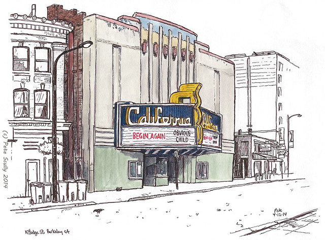
Last week was the event of the 44th Worldwide Sketchcrawl. Regular listeners will know I have been on many of the worldwide sketchcrawls over the years in many cities. Last Saturday morning I woke up, and decided: I’m going to Berkeley. The sketchcrawl was on the UC Berkeley campus, which for me was significant as one of the first sketchcrawls I ever took part in (it was in fact the second, the first being in Davis at the end of 2005, but I did not do much that day) was at UC Berkeley, in March 2007. On that day I sketched a lot but kept to myself, too shy to talk to other sketchers. I’m not so shy these days, but I did sketch solo, though it was great to meet and talk to other sketchers. I also remembered just how much I love being in Berkeley. The theatre above, the Calfiornia, I sketched in the morning before meeting the sketchcrawlers. I remember one of the last times I was in Berkeley saying, I must sketch that next time. That was five years ago, so I got there eventually.
south hall uc berkeley
Above, my first sketch of the day. It took about an hour and a half, and I had intended to colour it but I haven’t yet. All of the colouring in I did was done later, because I didn’t bring a little jar of water for my paints (of my two small jars, one was lost and one broke, I haven’t found a good small one since). I don’t really do the waterbrush thing any more. So, it gives me more time for penwork, diving into the details. This is South Hall. Davis has one of those too, but it’s not as nice as this. This radiates grandeur.
bowles hall uc berkeley
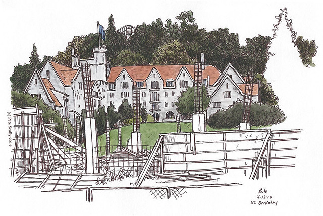
This is a building I have sketched before, Bowles Hall further up the hill. It looks like an old English country public school (Americans note, ‘public’ school in England is actually what we call private schools; our public schools are called ‘state’ schools. Mine was always in a state, anyway). I sketched it in 2007 on a much sunnier day (sunnier, but through the fog I actually still got burnt last week, stupid deceptive weak bay fog). This time there was construction going on in front of it, so I imagine this view will look different next time.
bancroft and college, berkeley
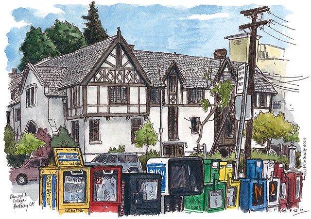
I went down the hill to the southern edge of campus, to the corner of Bancroft and College. This building is called the Free House I think. I was enticed by the colourful newspaper boxes which again, I had to colour in later, but spent a good deal of time (just over an hour) sketching all the little marks on each one. By the time I was done it was time to reconvene with the other sketchers, back at Sather Tower. There was quite a gathering. Here I am with a few fellow sketchers (left to right) Jana Bouc (one of the SF Bay Area Urban Sketchers and whose own sketchblog Jana’s Journal in fact inspired me to start this very blog you are reading); Pete (that’s me there with uncoloured version of sketch above); Gary Amaro (also an original Urban Sketchers correspondent, see his work online at garyamaro.blogspot.com); and Flory Nye-Clement, a sketcher from Benicia (who by the way is organizing a sketchcrawl at the Benicia Capitol State Historic Park on August 23, starts at 11am). Results of the sketchcrawl in Berkeley are being posted on the forum at sketchcrawl.com.
berkeley sketchcrawl

I’ve been quite a hermit lately in terms of sketching, and I must say it was very nice to get back out there and meet fellow sketchers again. It’s always good to rub shoulders with other people on this planet who ‘get it’. Hey, there are a lot of us urban sketchers out there!

moving, keep on moving

our new house
One of the other reasons I’ve been so busy lately is because we just moved house. Still in Davis, not even far from our old place but moving al the same. I love every single aspect of moving. The boxing up of every single thing no matter how miscellaneous, carrying heavy boxes of books, moving furniture, going through all of your things and saying, do I need this, do I need that, and then saying yes I do, remember the last time we moved? All the cleaning, taking down the curtains, filling in the holes where the pictures hung, figuring out if the furniture you have will fit in the shape of new place, all of the stress thinking about it which makes you really ill for a week before the move, I love it, it’s my favourite thing ever, even better than airports. Not really. Two weeks after the move we’re still unpacking, fitting into the new space, getting used to the quirks, but it’s a nicer place and I like it. Before we left our old place I decided to sketch it. So now we live in our fourth place in Davis since 2005. A new chapter!
our old house

decks appeal

Wyatt DeckAnd so, finally back to posting some sketches, if I can even vaguely remember what that feels like. The World Cup is over! Gone for another four years, what will we do? It’s not like there is any other football to watch in that entire time. Haha. I enjoyed going over the kits so much I may even torture you all with more, from the clubs, as many as I can possibly do. Mwahahaha. And football-puns? You ain’t, as they say, seen nothing yet. Oh, alright I’ll lay off the puns for a while, it is pre-season after all. I need to train for a few weeks to get my football-punning back up to match fitness for the new Premier League season starting in August. Expect to see me jogging around the green belts of Davis trying to make punchlines out of Pocchetino and find an angle on Van Gaal (you see? Much training needed). But in this time of world-cup-football-ness, amid all the dodgy haircuts and the acrobatic goalkeeping and the constant non-stop biting (it was only the one bite, wasn’t it?), I did manage to do some sketching. This was a panorama I did over two lunchtimes at the Wyatt Deck in the UC Davis Arboretum. Technically it was three lunchtimes but on one of them I didn’t do any sketching as I forgot my pen (doh!). I had intended to add paint to it as well but I decided I preferred it like this. I listened to a History podcast while sketching and it was a man who was a South American football historian talking (among other things) about the great Uruguay team of the 20s and 30s, the River Plate team of the 50s, and what football meant/means in terms of national identity among the nations in South America, how historically it was able to strengthen their differences while also presenting them with an opportunity to announce themselves globally (at the Olympics and later the World Cup). Very interesting. It’s funny how what you listen to when you sketch gets so involved with how you see the sketch from thereon – none of you will see any reference to Paraguay’s style of play or the founding of great Brazilian clubs by British immigrant workers in this drawing of some wooden buildings at the Arboretum, but I see those great south American football names in every line drawn. Except in the middle, which will always be about Batman, because I was listening to another podcast by that point which talked a lot about the Tim Burton Batman movie. Again, you can’t see that, but I do. Now I always wonder what was really going through artist’s minds when they were creating their work. I look at one of Mondrian’s compositions and I think, I wonder if he was thinking about getting a cat and in between colouring in those squares whether he went down to the pet shop to look at kittens, I don’t know. You don’t know. Or when Van Gogh painted that portrait of himself with no ear, maybe in fact he was listening to his annoying unemployed next door neighbour practicing their singing really badly day in, day out, and he just subconsciously painted himself with no ear without even thinking about it, you just don’t know do you. Or when Damien Hurst was putting that sheep into the formaldehyde, maybe at the same time he was listening to his favourite gardening show on the radio? And now every time he sees that sheep he keeps thinking, ooh I’d better water the petunias when I get home. You just don’t know.

By the way, click on the image above and you’ll see a bigger version. What you won’t see is any reference to Boca Juniors or Bruce Wayne.

the kits are alright (part 3 of 3)

The World Cup Final is upon us. The semi-finals were a little unbelievable: Brazil, oh Brazil. Didn’t I say, “keep the white shorts“? Didn’t I say that? I think I did. “Those white shorts look better Brazil, they’re lucky, don’t change back to blue!” Brazil wore their proper combination of yellow / blue / white, and…um…. let’s say the last time Brazil suffered a home World Cup humiliation, in 1950, they wore their once-traditional white shirts…and never wore them again. It’s safe to say their 7-1 defeat to the Germans (a scoreline which flattered Brazil) was a little bit more humiliating, given their galactic history since the Maracanazo against Uruguay. Maybe it’s time to change to, I dunno, all green or something. Germany wore the nicer of their two kits, the black-and-red Flamengo kit, but I think they could have run around in big frilly Victorian dresses and still score at least four goals. And then there was Argentina vs Holland, the polar opposite. I got very excited when I saw Holland in orange shirts and white shorts, against Argentina in their proper black shorts with the blue and white striped shirts. They looked right, finally. Unfortunately it was a match so boring, not even the proper-ness of the kits could rescue it. Who won again? I don’t care.

And as we prepare for the final (Germany against who was it again?), an all-Adidas, all-wrong-shorts affair, here is my run-down of the rest of the World Cup kits. I promise to post some of my recent out-and-about sketches very soon, but the World Cup month is nearly over, and boy will I miss it. I’m sure you won’t!

THE WORLD CUP KITS: PART THREE

  • MEXICO: (Adidas) mexicoMexico’s kit is a winning design this time around. Mexico have had some crazy outfits in the past (not to mention the fluorescent day-glo highlighter pen costume of their 1994 goalie, Campos), but this one has little lightning strikes on the home shirt, and little zigzags all over the red away shirt. No plain white shirts, no not-well-thought-out black shirts, just classic and unique designs. My son was a big fan, so I got him the green one, and it’s a really nice top, very well cut both front and back. Mexico were unlucky to go out.
  • NETHERLANDS: (Nike) netherlandsOrange is the new Orange. This is a very simple design from the Oranje this time around, nothing interesting but it is clean and thankfully not all one colour, with the white shorts (though all-orange was worn three times, which I think looks a bit too much like a Tango-taste-sensation, Tony). The proper outfit eventually came out against Argentina in the semis…ah yes, they lost that on penalties. The away kit got a couple of outings, an all-blue number in varying shades, which was bloody difficult to reproduce in MS Paint, I do hope you appreciate that one. This was forever be the kit worn when Robin Van Persie scored that header as they destroyed Spain.
  • NIGERIA: (Adidas) nigeriaOne shade of green isn’t enough. Two shades work much better. Nigeria have a mixed kit history, their best in my opinion being the 1994 home and away outfits. This is a decent effort, in the current Adidas template of choice, with a unique enough colour scheme. Nigeria played pretty well in the end and it was a shame to see them go out, but France just had a better kit. Not that quality of kit is what sees a team through (cf: Germany in the World Cup Final, if they wear white). From the TV screen though this shade is conveniently football-pitch-coloured. The away kit is all-white, I suppose.
  • PORTUGAL: (Nike) portugalRonaldo Ronaldo Ronaldo Ronaldo. If only. This was a very do-not-adjust-your-sets design from Nike (remember when you had to adjust your sets? Ah, the olden days) in two shades of red with a little green trim. I preferred the one they had at the last World Cup, the red with white shorts and green socks, but they were just so abject in this one that they did not even get a chance to wear their white and navy away kit, which is a shame as it was very nice. This is how England’s kit should have looked. Now, both this one and that one are in the out-first-round bargain bin.
  • RUSSIA: (Adidas) russiaI’ll first talk about the away kit, whose design is based upon how Yuri Gagarin (I think, or it may have been that dog Laika) saw the Earth from space. Funnily enough this is the same view Germany got of the field when they played against Brazil, miles and miles of space. I think it’s one of the nicest shirts at the tournament, though a bit disappointed it doesn’t come with big space helmets. The first shirt however is back in the USSR. Well, it would be if the USSR ever wore shirts like that, which I’m pretty certain they didn’t (preferring a more communist shade of red with a white trim and CCCP across the shirt; FIFA probably wouldn’t approve of that now). Nice try, Russia. They did move back to all-red a few years ago when they decided the Russian-flag-inspired white-blue-red wasn’t really their thing. I wonder what they will go for when they host the next World Cup. Hopefully a different manager, who actually likes football.
  • SOUTH KOREA: (Nike) south korea Korea’s kit was a pretty decent effort from Nike, which gave the effect of a French schoolkid wearing a backpack. That is a reference to when I was a teenager and you could always tell the foreign exchange students by the way they wore their backpacks, ie, with both straps. English schoolkids always wore backpacks with just one strap, as though it was so uncool to have both straps on. The away kit goes for what I can only think is a reference to a hitherto-unknown sub-culture who wears two backpacks one-strap at a time.  That must be pretty uncomfortable. It’s a tidy short though that would have looked nice on England, but alas both are now in the gone-home-early bargain bin.
  • SPAIN: (Adidas) spainOh dear. End of an era. Don’t mess with tradition Adidas, it never, ever works (except for Germany and Argentina to name two completely obvious exceptions). Ok, so Spain ditched their blue shorts, and plumped for a golden rather than yellow trim. They are the reigning World and double-European champions after all. They can do what they want, even include little pinstripes all over the shirt (what is it with that this World Cup?). But I mourned the loss of blue shorts in this design. Not for long though, as they’ll get them back next time no doubt. Now here’s a thing, Spain had three kits this World Cup, played three games and wore all of them. Their black second kit, a striking Chelsea-esque design with an ‘electric yellow’ trim (what is it with ‘electric’ yellow, electricity is blue*, or white, you have got a very funny electric company if your electricity is yellow) (*ask David Bowie if you don’t believe me) was apparently too dark for their opening match against Holland (who play in orange, but in that match they played in blue, I’m so confused) so FIFA told them to make a white kit, not available in the shops. This white one has little pinstripes too. Spain, the intergalactic-everything-champions, were the first team out. End of an era? Yes, but they’ll get the blue shorts back, and the good players too.
  • SWITZERLAND: (Puma) switzerlandRed home, white away. What do you want? It’s Switzerland, it’s what they do. They aren’t going to suddenly go all experimental and mess about with tradition and add whole new swatches. Or Swatches, for that. But don’t be deceived into thinking this is a boring kit. Those white stripes down the side actually open up to reveal a whole array of camping knives, tin-openers, nail files, corkscrews and other obvious cliches. No I actually like this shirt a lot, it’s pretty neat and timeless without being boring. 
  • URUGUAY: (Puma) uruguayThe collar of La Celeste’s famous sky blue home shirt looks as though a bite has been taken out of it, can’t imagine who’d do that. Yes there really is only one thing that can be talked about with regards Uruguay in this World Cup isn’t there, and it’s such a shame because they could have been so much better. They did well to get out of the groups after all. The Puma kits were pretty nice, with a cool little Uruguay flag-inspired bit on the arm. “Bit on the arm?” Oops, slip of the tongue there.
  • USA: (Nike) USAUSA! USA! Livin in America, coast to coast, across the nation. This World Cup, with its heroic team of endless tryers and its superhuman goalkeeper, has been massively popular over here in my adopted home. It’s funny that nobody will remember the home shirt, which they wore more often, but the Captain America-like away kit (maybe it’s more Iron Patriot) became an instant classic after their opening victory against Ghana. At Soccer and Lifestyle this shirt sold out very quickly, and I regret not getting it now. The home shirt is very stylish, like a polo shirt, one of the nicest they’ve had in a while. I live in America. I feel good.

And so that is that. Thanks for sticking with me this far. Oh, you didn’t? Well never mind. It’s back to nice sketches of little downtown buildings very soon. For now, there’s a World Cup Final to watch.

shirty business (part 2 of 3)

IMG_0816IMG_0853 sm

WORLD CUP FOOTBALL KITS: Continued…

And so after another pause in posting (due this time to moving house) I return with more from my run-down of all the kits from all the teams at this spectacular-except-for-the-quarter-finals-which-were-rubbish FIFA World Cup Brazil 2014. There will be ten looked at here, then another ten which I will review at the end of the tournament. Before I go on though, a few points about kits so far…

  1. Brazil keep wearing white shorts with yellow shirts. This is due to FIFA’s paranoid ruling about ‘contrasting colours’ which is utter nonsense if you ask me. If it confuses referees when a team wears blue shorts with a yellow shirt then perhaps you need to select better referees. When they wore white shorts against Columbia, who were kitted out in red shirts with very dark navy shorts, the referee seemed to be completely blind to such things as serious career-threatening fouls but heaven forbid Brazil wear their proper outfits. Three times in this tournament, in Brazil’s home tournament, have they been made to wear this ‘off’ combination, they who have the most recognizable kit combo in world football. It is to the point where, in years to come, what people will remember is not the ‘classic’ kit but the wrong kit. At least in the semi against Germany they should wear the proper combo – except of course Germany will again wear white shorts, and again, everything is wrong. Wrong, wrong wrong. At least Southampton are back in red and white stripes.
  2. No, that’s it, that’s my main point.
  3. Actually back to this point on kit combos, would it have really been so confusing for France to wear white shorts with their navy shirts and red socks, and for Germany to be the ones to change into their now-not-official black shorts? Come on FIFA, that looks RIGHT. I’m surprised FIFA don’t have a ruling on national anthems not being too similar as well, and national flags cannot be waved that have too many contrasting colours, so perhaps countries need FIFA-endorsed versions perhaps in the colours of FIFA-sponsors. Ok, rant over. YEAH RIGHT…read on for more ranting.
  • ENGLAND: (Nike) englandOh dear. Look, England were Umbro for a very long time and that was good. Some shirts were a little underwhelming, but on the whole they were unique and fairly stylish. Last year they switched to Nike after Nike sold Umbro (which they’d bought a couple of years earlier with the intention of taking all of their contracts from them and driving them out of business – which thankfully they have failed to do). Their first Nike shirt was very plain with a round navy collar – and navy shorts. This has been followed less than a year later with an even plainer white shirt with a much plainer collar and FIFA-friendly white shorts. Design-wise it’s almost exactly the same as my old school team kit, minus the scratchy fabric but with just as much “hoof it away!” tactics. England did therefore look rather like the 1987 first-year Edgware School team, who may have at least put in a better showing than this rabble. The plain-ness of the shirt ws supposed to be inspired by England’s football history (you will note the big empty space all over the shirt). If you look very closely though, you will see tiny little pinstripes. The red kit has them too but they never got a chance to wear that. And of course, the kit (as they all are these past couple of years) way more expensive than the last ones. At least they were, before an early exit means you will probably find them in the bargain bins, while Nike prepares to bring out another, with slight variations, for like 500 quid each. 
  • FRANCE: (Nike) franceAnd then Nike comes up with far and away the BEST kit of the tournament. So good in fact, I just had to buy it. Allez les bleus! I must say that while Adidas and France seemed so natural for so long, during their waning years the French Adidas shirts were looking ever more desperate. As were the on-field antics of the team. When they switched over to a nice, clean Nike outfit it was like a breath of fresh air. This now is their third one so far, and their best, a classic rugby-shirt style top in navy blue, white shorts and red socks. Rugby is very popular in France so this feels pretty natural. The away kit has the mariniere look but with muted grey hoops. The FFF have also gone for the more olden-days badge reminiscent of the Just Fontaine era, making this look more like an old Tottenham shirt. And it feels really nice to wear as well. I’ve never been a massive fan of L’Equipe de France, but I used to avidly read France Football when I lived over there and I love this kit so much. So it’s time to dust off the Johnny Halliday song from 2002 and sing, “Allez Les Bleus, On Est Tous Ensemble!” Though unfortunately, they never got to wear the whole ensemble, being made to wear navy shorts with the home shirt each time at the World Cup. As Del Boy would say, “Cordon Bleu!”    
  • GERMANY: (Adidas) germanyDon’t get me started. Oh alright then. We go from the bland England non-kit, to the amazing super-kit of France, to the downright falsch of the Mannschaft’s 2014 kit. I go on about the colour of shorts as if the global economy depends on it but there are very few absolute unchanging constants left in world football. As we’ve seen, the Brazilians have had to suffer the indignity of white shorts with yellow shirts. Oh the shame! Spain as we’ll see are in all red now, no more lovely blue shorts. But Germany…Germany must be white shirts, black shorts, anything else just isn’t Germany. It just isn’t right. Das ist nicht cool. So when Adidas announced Germany would be in all white? Ich don’t think so! but it gets worse. All white, with a massive three-types-of-red chevron. There is a slight golden band but it looks pretty clear, this is a red and white with a bit of black Germany. Not a good kit at all. In my opinion the worst that the DFB have ever had (and I’m a big fan of the crazy 1994 kit). As for the away kit…I prefer traditional green and am sceptic of black and red away kits for Germany, but this one is actually lovely. A nice button-up collar-less neck, but the black and red hoops are actually a Brazilian reference – an homage to the great club Flamengo, Brazil’s most popular team, and that rescues this kit. Sehr toll.
  • GHANA: (Puma) ghanaI do like Ghana’s kit. Made by Puma, who have been producing some incredible individual African kits over the past few years, this is another which blends in Ghana’s colourful culture with the classic white kits of the famous Black Stars, so popular during the 1960s hey-day. Ghana have had a great if aging group of players for a while now and I’ve wanted to see them progress in world football, but this year it was not to be. Their home kit though has colourful touches on the collar, and a nice patterned red away kit.
  • GREECE: (Nike) greece“Meh.”  Greece used to wear all blue as their first kit, but after winning the Euro 2004 tournament they switched to all-white. An imaginative decision. This is a decent kit, I suppose, nothing to write home about, it just “is”. Greece never spends any time at all thinking about their football kit design. And yet in all this it still looks a great deal more exciting than England’s. You might say design-wise this isn’t too far from my lovely France kit? Yet in truth it feels a million miles away.
  • HONDURAS: (Joma) hondurasThe only Joma kit at the World Cup, thankfully. Remember when Honduras had those nice blue and white stripes? We need more stripes in world football. Well they don’t have them any more. Not an awful kit, maybe more detailing than Greece’s effort and I like their big Rimmer-esuqe ‘H’ badge, but it’s all very underwhelming. It’s a bit like being at a festival and there being two or three epic bands, but you have to stand through a bunch of utter dross which does little other than sober you up thinking, why do I even like music? It’s just dull repetitive noise coming from an amplifier. Kits like this make me feel like that.
  • IRAN: (Uhlsport) iranThe word on this kit was that it apparently shrinks. Made by Uhlsport, the Iranian officials apparently could not bring too many with them to Brazil and asked their players not to swap them, but due to a defect in the design they apparently got smaller as they got wet – not great for sweaty Brazil. Well, I didn’t see much evidence of that, and despite them being by Uhlsport – which reminds me of UHL milk, in that it’s not as good as normal milk but doesn’t go off for weeks – these are actually decent designs. They both incorporate the rare Asiatic cheetah, to highlight the plight of this endangered Iranian species (whose population is, um, shrinking).
  • ITALY: (Puma) italySkinny is the word! When these were first modeled by Balotelli, Pirlo and so on, they really showed off their highly toned masculine frames. Made by Puma, the home shirt has a nice cut and a thin collar, with little flashes of the Italian flag amidst the lighter blue of the Azzurri. The away kit has nice pinstripes. Perhaps it needed bite-proof shoulder pads as well. Or maybe it is just a really tasty shirt?
  • IVORY COAST: (Puma)  ivory coastOrange isn’t unique to the Dutch. The Ivorians of Cote D’Ivoire – aka the Elephants – have a plain orange outfit with some little orange details on the shoulder, a design which is repeated in the green away kit. They get a white third kit, a many teams do, in case FIFA start crying that they can’t tell the difference on their ancient black and white TVs.
  • JAPAN: (Adidas) japanAnother of Adidas’s more unique designs (except for the ubiquitous three stripes down the arms), this ‘samurai blue’ kit, the classic colour of the Japanese team, is also complemented by flashes of hot pink. You can’t see it but on the back there is what looks like a swipe of pink paint. The Japanese sun of the war flag is surrounding the badge in blue. Nice kit, I like it. The away kit is a rather luminous ‘electric yellow’ which would have been pretty easy to spot, if they’d been in the tournament long enough to wear it.

kits out! (part 1 of 3)

IMG_0841IMG_0818

WORLD CUP 2014 FOOTBALL KITS

As you may be acutely aware I rather like football shirts. Way more than I even like fire hydrants, which is saying something, I know, but it’s true. Every season I eagerly await news of any new kit release, clicking on links to reports of what Partick Thistle’s away shirt might look like, nodding appreciatively when teams like Nantes announce a new deal with Umbro, or shaking my head at the width of stripes on a new Milan jersey. The World Cup therefore is as much about the kits as it is about the players – I know more about the kits, for one thing (whereas I barely recognised half the England team, though that guy up front with the big mop of hair looked familiar, Dwayne Rodney I think he was called). So here is a helpfully-unillustrated run-down of the kits of each team at this year’s World Cup. Non-kit-enthusiasts, look away now (my next post will be a nice urban sketch I promise).

Before I start, here are some kit stats:

  • BRAND WITH MOST TEAMS (GROUP STAGE): Nike (10). Followed by Adidas (9), Puma (8) and Burrda, Joma, Lotto, Marathon, and Uhlsport (1 each) – no Umbro this year!
  • BRAND WITH MOST TEAMS (ROUND OF 16): Nike / Adidas (5 each), followed by Puma (4), Burrda and Lotto (1 each)
  • BRAND WITH MOST TEAMS (QUARTER-FINALS): Nike / Adidas (3 each), followed by  Burrda and Lotto (1 each). Bad luck Puma!
  • MOST PREDOMINANT HOME SHIRT COLOUR: White (9)*, then Red (8)*, Blue (5)*, Yellow (4), Green (3), Orange (2).  *Croatia are red/white, so I didn’t include but are arguably predominantly red; Argentina have blue stripes but are definitely more white this year.
  • MOST PREDOMINANT CHANGE SHIRT COLOUR (WHETHER WORN OR NOT): White (14), followed by Blue (8) and Red (6)
  • COUNTRY WITH MOST KITS: Spain (3), and they wore all of them. Brazil have a third too but will not wear the black one.
  • COUNTRIES WITH ALL-ONE-COLOUR HOME KITS (official, not the matchday FIFA-enforced variants): 17 (out of 32). 9 are all-white.

And now for my thoughts on the countries. I’m going to give this to you in three parts. It will be alphabetical. And all of the kit illustrations are mine, created in old-school MS Paint…

PART ONE:

  • ALGERIA : (Puma) Les Fennecs (Dalgeria 2014
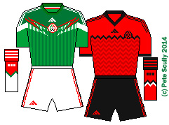
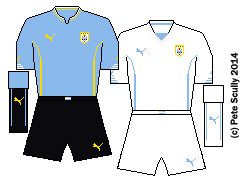
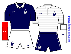
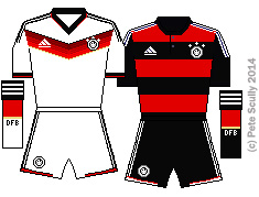
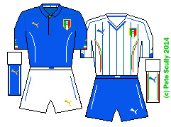
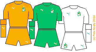
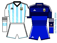
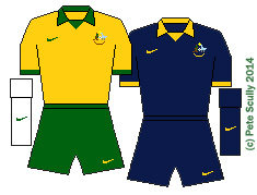
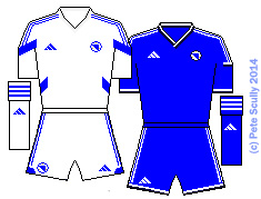
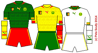
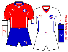
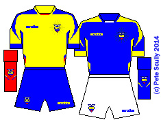
esert Foxes) have been one of the popular teams in this tournament, and I like their kits. Simple design but with a nice shade of green trim, which from the TV viewers point of view makes them blend in with the pitch. Puma kits tend to be more form-fitting these days so muscular physiques show up more. Some very muscular players in this World Cup too. In Algeria’s green away kit they look rather Hulk-esque.
  • ARGENTINA : (Adidas) argentina 2014Controversial. For the first time ever, Argentina have decided to go with white shorts instead of black as their official home shorts – as have Germany, as you’ll see. Sure they’ve been made to wear white shorts before (1990 World Cup I think) but it was not the official combination. Still…it doesn’t actually look bad. The home shirt (with it’s black trim!) looks nice, the blue stripes being graded lighter at the bottom to apparently make them look like a flag in the wind (what?). But lack of black shorts? Controversial. I’m surprised Maradona hasn’t gone on TV saying it’s a Malvinas-based conspiracy by FIFA and the Sunday Mirror. I suppose we can blame Adidas. They’ve done this a few times this World Cup, as you’ll see. I love that graded blue away kit though, one of the top five in this cup.
  • AUSTRALIA: (Nike) australiaDecent 1st kit, with a yellow top reminiscent of one Brazil had recently, with dark green Shorts, and – excitingly – white socks! This is a big deal. Fans had campaigned for years to have white socks again, after more than two decades. And you think I’m crazy about these things. Well done Nike. The 2nd kit is nice, dark blue with gold trim, always a winning combination for me. The collar is very retro, 70s-esque. Think Prisoner Cell Block H.
  • BELGIUM: (Burrda) belgiumLes Diables Rouges have had some nice kits in the past, and Burrda have have some questionable kits. Burrda… it sounds like something Taggart would say in his tough Scottish growl. “Aye, there’s been another Burrda”. They’re a Swiss company apparently. These kits are alright. The massive crown motif is different. At least they are unique, no other Burrdas at this World Cup, or any. Black change kit a little zany, plus a yellow third kit based on the home shirt, all have that round Belgian flag collar which is nice. Allez les Belges!
  • BOSNIA-HERZEGOVINA: (Adidas) bosniaFirst World Cup for Bosnia-Herzegovina, who were previously in a Legea kit, but they obviously decided last minute that Legea were too non-league for them and switched to Adidas, who to be fair quickly gave them a template you’d probably find in the non-league. Boring. But World Cup kits aren’t always interesting.  Not like I devote hours and hours of my time to them or anything…
  • BRAZIL: (Nike)brazil It’s Brazil, what do you want? Well blue shorts for one. Twice in this tournament they have turned out in non-trad white shorts with the classic yellow shirts. That is WRONG! This is BRAZIL! Most recognizable combination in history. So, home kit is not bad, collar’s a bit “meh”, not much else to the design, nothing unique to say “this is our World Cup! We are spectacular!” The blue 2nd kit has nice detailing, though I prefer a white collar. For some reason they have a black 3rd kit (or is it dark grey?) which they won’t wear, which is a shame because the shorts have peculiar multi-coloured horizontal stripes. Which is not something you see every day. Now…the question is, if Brazil get to the final and lose in yellow, will they retire it? When they lost to Uruguay at the Maracan in 1950 they wore white, their usual colour. It was such a tragedy they swore not to wear white shirts again, and then had a competition to choose a new combination. The winner was yellow shirts, green collar, blue shorts and white socks. So I ask you, will they change kits again if they lose? Not likely!
  • CAMEROON: (Puma) cameroonThe Indomitable Lions have one of the most vibrant kits at this cup, with a very busy pattern that has their nickname repeated throughout. It’s just a shame the team were not as busy on the pitch. I’m surprised Puma didn’t make nice long pockets on the shorts for the players to safely stash their bonus cash. The yellow second kit has the same pattern, while the white 3rd kit was, let’s face it, a bit hopeful. Cameroon have a fun kit history though, always good for some innovation. Remember the full bodysuit one with the lion-claw slashes on the side? And who can forget the sleeveless top from over a decade ago, that looked like a basketball top, which FIFA said they couldn’t wear at the World Cup. They had to sew on black sleeves. Shame, it was a classic.
  • CHILE: (Puma) : chileChile have been one of everybody’s favourite second teams (along with Mexico, Algeria, and about half a dozen or so others), and their Puma kit is very decent. That collar looks like it’s going to be round and then in the middle it’s like, oh hello, pointing downwards. The collar on the away kit probably got worried it was too low cut and so added a little bit extra beneath it. Sorry, they’re not that interesting, I’m grasping here. But they are decent, and the home is one for the hipsters to wear on their Saturday morning kickaround before going to the barbers for a tattoo and eating a latte on their organic wind-powered bike.
  • COLOMBIA: (Adidas) : colombiaOk Colombia, we have to talk. Listen, everyone’s happy you’re such a great team now, even without Falcao, but your kit combo just jars a little. It’s the white. It’s those sloping lines. I used to like the old yellow Umbro kits with the blue shorts, Carlos Valderrama, Faustino Asprilla, and who can forget the goalie Rene Higuita with his metalist’s hair, long runs up the pitch and his scorpion kicks. However, I have a feeling this kit will grow on me considerably, and with a good World Cup it could be one to remember. In thirty years time adidas or whoever will be making their shirts then (under armour or someone) will be bringing out kits to look like this one. A future retro classic.
  • COSTA RICA: (Lotto): costa ricaNice to see Lotto having a kit at the World Cup. Actually it would be if it were one of those kits from back when Holland had them, 1994, around then. These days Lotto kits are a bit of a mess. Costa Rica has that wavy bizarro-Peru thing going on and the collar seems to stop then start again several times. Yet, like the team, I kinda like it. It kinda works. No 1990-era lucky black-and-white stripes from them this time, though they seem to have adopted their white kit as being ‘lucky’ this time. FIFA will be pleased.
  • CROATIA: (Nike): croatiaBefore every international tournament kit release season I say to myself, I’m going to close my eyes and imagine what Croatia will do, will it be red and white squares for home with a blue away kit that has those red and white squares along the trim? Oh yes, that again. Home kit is nice, but I prefer more white than the red on the sleeves, but what do I know. Apparently their first kit in 1990 had the red sleeves. Not too much you can do with an already memorable design so they keep it simple. I for one, in this age of attempted homogenizing international kits, am glad this kit exists. With blue socks (as they wore in the opening match) it works even better. 
  • ECUADOR: (Marathon) ecuadorA sunny kit, made by Marathon who are an Ecuadorean company which is very nice. The change kit is just a reverse. Another for the hipsters, though they didn’t make it out of the group stage this time around. Nice little sun element around the badge. Not much else to say really, it’s flag-coloured.

Phew! Join me for Part Two, which will come when I’ve drawn more kits…