

WORLD CUP FOOTBALL KITS: Continued…
And so after another pause in posting (due this time to moving house) I return with more from my run-down of all the kits from all the teams at this spectacular-except-for-the-quarter-finals-which-were-rubbish FIFA World Cup Brazil 2014. There will be ten looked at here, then another ten which I will review at the end of the tournament. Before I go on though, a few points about kits so far…
- Brazil keep wearing white shorts with yellow shirts. This is due to FIFA’s paranoid ruling about ‘contrasting colours’ which is utter nonsense if you ask me. If it confuses referees when a team wears blue shorts with a yellow shirt then perhaps you need to select better referees. When they wore white shorts against Columbia, who were kitted out in red shirts with very dark navy shorts, the referee seemed to be completely blind to such things as serious career-threatening fouls but heaven forbid Brazil wear their proper outfits. Three times in this tournament, in Brazil’s home tournament, have they been made to wear this ‘off’ combination, they who have the most recognizable kit combo in world football. It is to the point where, in years to come, what people will remember is not the ‘classic’ kit but the wrong kit. At least in the semi against Germany they should wear the proper combo – except of course Germany will again wear white shorts, and again, everything is wrong. Wrong, wrong wrong. At least Southampton are back in red and white stripes.
- No, that’s it, that’s my main point.
- Actually back to this point on kit combos, would it have really been so confusing for France to wear white shorts with their navy shirts and red socks, and for Germany to be the ones to change into their now-not-official black shorts? Come on FIFA, that looks RIGHT. I’m surprised FIFA don’t have a ruling on national anthems not being too similar as well, and national flags cannot be waved that have too many contrasting colours, so perhaps countries need FIFA-endorsed versions perhaps in the colours of FIFA-sponsors. Ok, rant over. YEAH RIGHT…read on for more ranting.
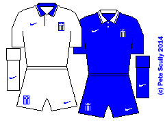
- ENGLAND: (Nike)
 Oh dear. Look, England were Umbro for a very long time and that was good. Some shirts were a little underwhelming, but on the whole they were unique and fairly stylish. Last year they switched to Nike after Nike sold Umbro (which they’d bought a couple of years earlier with the intention of taking all of their contracts from them and driving them out of business – which thankfully they have failed to do). Their first Nike shirt was very plain with a round navy collar – and navy shorts. This has been followed less than a year later with an even plainer white shirt with a much plainer collar and FIFA-friendly white shorts. Design-wise it’s almost exactly the same as my old school team kit, minus the scratchy fabric but with just as much “hoof it away!” tactics. England did therefore look rather like the 1987 first-year Edgware School team, who may have at least put in a better showing than this rabble. The plain-ness of the shirt ws supposed to be inspired by England’s football history (you will note the big empty space all over the shirt). If you look very closely though, you will see tiny little pinstripes. The red kit has them too but they never got a chance to wear that. And of course, the kit (as they all are these past couple of years) way more expensive than the last ones. At least they were, before an early exit means you will probably find them in the bargain bins, while Nike prepares to bring out another, with slight variations, for like 500 quid each.
- FRANCE: (Nike)
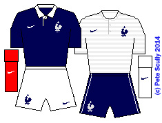
 And then Nike comes up with far and away the BEST kit of the tournament. So good in fact, I just had to buy it. Allez les bleus! I must say that while Adidas and France seemed so natural for so long, during their waning years the French Adidas shirts were looking ever more desperate. As were the on-field antics of the team. When they switched over to a nice, clean Nike outfit it was like a breath of fresh air. This now is their third one so far, and their best, a classic rugby-shirt style top in navy blue, white shorts and red socks. Rugby is very popular in France so this feels pretty natural. The away kit has the mariniere look but with muted grey hoops. The FFF have also gone for the more olden-days badge reminiscent of the Just Fontaine era, making this look more like an old Tottenham shirt. And it feels really nice to wear as well. I’ve never been a massive fan of L’Equipe de France, but I used to avidly read France Football when I lived over there and I love this kit so much. So it’s time to dust off the Johnny Halliday song from 2002 and sing, “Allez Les Bleus, On Est Tous Ensemble!” Though unfortunately, they never got to wear the whole ensemble, being made to wear navy shorts with the home shirt each time at the World Cup. As Del Boy would say, “Cordon Bleu!”
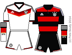
- GERMANY: (Adidas)
 Don’t get me started. Oh alright then. We go from the bland England non-kit, to the amazing super-kit of France, to the downright falsch of the Mannschaft’s 2014 kit. I go on about the colour of shorts as if the global economy depends on it but there are very few absolute unchanging constants left in world football. As we’ve seen, the Brazilians have had to suffer the indignity of white shorts with yellow shirts. Oh the shame! Spain as we’ll see are in all red now, no more lovely blue shorts. But Germany…Germany must be white shirts, black shorts, anything else just isn’t Germany. It just isn’t right. Das ist nicht cool. So when Adidas announced Germany would be in all white? Ich don’t think so! but it gets worse. All white, with a massive three-types-of-red chevron. There is a slight golden band but it looks pretty clear, this is a red and white with a bit of black Germany. Not a good kit at all. In my opinion the worst that the DFB have ever had (and I’m a big fan of the crazy 1994 kit). As for the away kit…I prefer traditional green and am sceptic of black and red away kits for Germany, but this one is actually lovely. A nice button-up collar-less neck, but the black and red hoops are actually a Brazilian reference – an homage to the great club Flamengo, Brazil’s most popular team, and that rescues this kit. Sehr toll.
- GHANA: (Puma)
 I do like Ghana’s kit. Made by Puma, who have been producing some incredible individual African kits over the past few years, this is another which blends in Ghana’s colourful culture with the classic white kits of the famous Black Stars, so popular during the 1960s hey-day. Ghana have had a great if aging group of players for a while now and I’ve wanted to see them progress in world football, but this year it was not to be. Their home kit though has colourful touches on the collar, and a nice patterned red away kit.
- GREECE: (Nike)
 “Meh.” Greece used to wear all blue as their first kit, but after winning the Euro 2004 tournament they switched to all-white. An imaginative decision. This is a decent kit, I suppose, nothing to write home about, it just “is”. Greece never spends any time at all thinking about their football kit design. And yet in all this it still looks a great deal more exciting than England’s. You might say design-wise this isn’t too far from my lovely France kit? Yet in truth it feels a million miles away.
 - HONDURAS: (Joma)
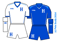 The only Joma kit at the World Cup, thankfully. Remember when Honduras had those nice blue and white stripes? We need more stripes in world football. Well they don’t have them any more. Not an awful kit, maybe more detailing than Greece’s effort and I like their big Rimmer-esuqe ‘H’ badge, but it’s all very underwhelming. It’s a bit like being at a festival and there being two or three epic bands, but you have to stand through a bunch of utter dross which does little other than sober you up thinking, why do I even like music? It’s just dull repetitive noise coming from an amplifier. Kits like this make me feel like that.
- IRAN: (Uhlsport)
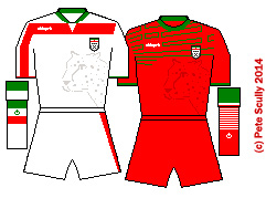 The word on this kit was that it apparently shrinks. Made by Uhlsport, the Iranian officials apparently could not bring too many with them to Brazil and asked their players not to swap them, but due to a defect in the design they apparently got smaller as they got wet – not great for sweaty Brazil. Well, I didn’t see much evidence of that, and despite them being by Uhlsport – which reminds me of UHL milk, in that it’s not as good as normal milk but doesn’t go off for weeks – these are actually decent designs. They both incorporate the rare Asiatic cheetah, to highlight the plight of this endangered Iranian species (whose population is, um, shrinking).
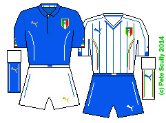
- ITALY: (Puma)
 Skinny is the word! When these were first modeled by Balotelli, Pirlo and so on, they really showed off their highly toned masculine frames. Made by Puma, the home shirt has a nice cut and a thin collar, with little flashes of the Italian flag amidst the lighter blue of the Azzurri. The away kit has nice pinstripes. Perhaps it needed bite-proof shoulder pads as well. Or maybe it is just a really tasty shirt?
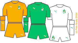
- IVORY COAST: (Puma)
 Orange isn’t unique to the Dutch. The Ivorians of Cote D’Ivoire – aka the Elephants – have a plain orange outfit with some little orange details on the shoulder, a design which is repeated in the green away kit. They get a white third kit, a many teams do, in case FIFA start crying that they can’t tell the difference on their ancient black and white TVs.
 - JAPAN: (Adidas)
 Another of Adidas’s more unique designs (except for the ubiquitous three stripes down the arms), this ‘samurai blue’ kit, the classic colour of the Japanese team, is also complemented by flashes of hot pink. You can’t see it but on the back there is what looks like a swipe of pink paint. The Japanese sun of the war flag is surrounding the badge in blue. Nice kit, I like it. The away kit is a rather luminous ‘electric yellow’ which would have been pretty easy to spot, if they’d been in the tournament long enough to wear it.


I’m not sure why but this weblog is loading extremely slow for me.
Is anyone else having this problem or is it a issue on my end?
I’ll check back later and see if the problem still exists.