“The World Cup starts next week!” I said last week to an American I know. I know quite a few Americans, what with living in California, and most of them are actually quite into the game they call soccer. Soccer by the way is a term that came from England, not America, being shorthand for ‘Association Football’, as opposed to ‘Rugby Football’ which the public school boys still call ‘rugger’. By the way, my American friends, in England ‘public school’ is what we actually call our private schools. If that sounds odd to you, well you call bums ‘fannies’ so I think we are about even. Anyway this particular American just gave a ‘yeah, so what’ type of facial response. Ten or fifteen years ago I might have taken this as normal but these days, I know so many Americans who are so into the game that they look forward to the World Cup almost as much as I do, so indifference is more unexpected than it used to be. And then I remembered – the USA aren’t in it this year. This is a big deal. They don’t have a team to root for. They might like another country for family reasons, or because they have the best shirts or the coolest players (all reasons I myself use, after all my team – Tottenham – is never in the World Cup) but it isn’t the same. America has gotten used to having a team on the biggest stage. Not a successful one, but they are there. It will be strange this year. No USA. No Holland. My own preferred team of Ireland (family connections, and historically my main supported national team) are not there. Even Italy are not there, mamma mia! Italy! It’s just not the World Cup without Italy. It’s like Christmas without the Sound of Music, or New Years Eve without endless Top 100 List Shows on Channel 4. It’s like a World Cup build-up show not making reference to Gazza’s tears. Still, I wouldn’t rule them out, dark horses, they always start a tournament late and so on. I am excited. I love all the flags, all the anthems, all the dodgy haircuts, the Panini stickers, the nostalgia for 1990 or other random World Cup we complained about at the time, but most of all I love the kits. For me, 1994 was one of the best World Cups for kits, but this year is looking like the best one since then, mostly because many of the Adidas kits are taking inspiration from that era. And so, as I do every big football tournament, I am going to do a run-down of every team along with an MS-Paint-drawn version of the kit.
If you come here for the sketches, well I still have plenty of those I am still scanning, so stay tuned. That said, this has been the least sketchingest year, compared to last year which was the most sketchingest. And that isn’t even a word. Ok, there are 32 teams in 8 groups, I’ll do 16 teams each post for 2 posts. Let’s start with Group A, which contains this year’s World Cup hosts, Russia.
GROUP A
RUSSIA
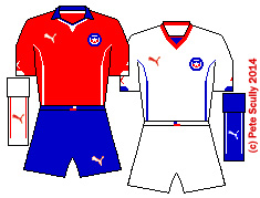
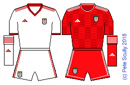
 There was controversy when Russia was selected, but that was largely because (a) England wasn’t selected and (b) Qatar was selected at the same time for the 2022 tournament. The biggest country ever to host the World Cup to the smallest. Despite current political climates, Russia is a much more traditional choice for World Cup host than a country that has never come close to the competition (cough cough Qatar), and has a long and storied World Cup history both as the USSR (Lev Yashin, Igor Belanov, Oleg Blokhin – oh yeah those two were Ukrainian, but still, played for USSR) and post-Soviet Russia (Oleg Salenko, and you know, some other people). Now the great Soviet teams played in, you guessed it, red, but the first post-Communist Russia teams played in white shirts – blue shorts – red socks, the order of the Russian flag. After a while they decided that the Soviet era was something to harken back to, so reverted to rich red shirts, and this continues with the current kit, in brighter red with white trim. It is a reminder of the Soviet kit from the late 80s, not the one they lost the Euros in, but the one they wore when they won the 1988 Olympics Gold Medal (2-1 vs Brazil, who had Romario in the team). The Soviets played well up front, they had a good perestroikers. Ok, Soviet era pun alert. This is one of Adidas’s retro feeling designs this summer and it is pretty nice. The away kit is strange, it has a graphic I do not understand. I want teams to do well based on their kits and this one should get them out of the group at least. They might not beat Brazil in the final this time though. From what I hear the team are pretty rubbish. However, I do think they will somehow get out of the group stage, if only so that Mister President has someone to support. PREDICTION: 2nd in group, out in Round of 16. KIT: 6/10 Home, 6/10 away.
EGYPT
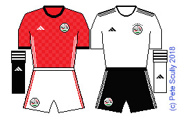 There is always a Group of Death in the World Cup, but Group A isn’t it (unless it’s in a kind of James Bond spy thriller kind of way). Egypt aren’t going to win the World Cup, but it is surprising that they haven’t been at the tournament since 1990, given that they are often one of Africa’s best teams, frequently winning the African Cup of Nations. This time they have the Liverpool star Mo Salah, coolest player in the world, though he is in a possibly-shoulder-dislocated state thanks to pantomime villain Sergio Ramos. This is also the Group of Easy, with only Uruguay likely to prove a challenge on the field. I would love Egypt to do well, however I think the hosts Russia will have the Host’s Bounce and edge them to 2nd place. Egypt play in red, with a white away kit just to be different, but the Adidas shirt this year is remarkably plain considering the company’s other offerings. Just lots of little red squares, what has that got to do with the Russia World Cup. I can’t offer anything like the ‘Perestroikers’ pun for Egypt, Pyramidfielders maybe. I’d like to go to Cairo someday, my mum went years ago and loved it, but she said the traffic is insane. PREDICTION: First Round exit. KIT: 4/10 home, 3/10 away.
SAUDI ARABIA
 Neighbours of Egypt, across the Red Sea, the Saudis were last in the World Cup in 2006, but the one I remember most was 1994, Saeed Al-Owairan, scoring that amazing goal against Belgium. That was brilliant. Honestly I have no other things to say because it’s the only thing I remember about Saudi Arabia at the World Cup, other than they usually have really boring kits. This year Nike are providing the boring kit. Well, we say boring, you might say plain and simple, classic, no nonsense, stylish. Ok, then you can say that. My ten year old son knows more about Saudi football than I do though, as one of his friends from the country supports one of the big club teams, and he has played as them in FIFA. For me, it’s all Saeed Al-Owairan, that goal was better than Maradona’s, the sort of goal you see on the schoolyard, not on the telly at the World Cup. That by the way is the sort of cliche you see in the schoolyard, not on the telly. Actually no it’s exactly the sort of thing they say, and maybe it’s not a cliche but it’s plain, simple, stylish. PREDICTION: First Round exit, bottom of the group. KIT: 2/10 (both)
URUGUAY
 Uruguay will win this group, no question. They should win all of their games, Egypt in the first match being their toughest opponent, but by the time they face Russia they will already be through and so will probably not worry too much about that game, given that they will play either Spain or Portugal in the next round. Suarez will probably not bite anyone this year, but if they face Spain I foresee an exciting clash with Sergio Ramos. Cavani would have a shot at top scorer this year if he manages to do hat-tricks in the groups, because I don’t think they will get past Spain or Portugal. You never know with this team though. Their kit is nice, another Puma effort, with a large detail showing the ‘Un Sol Para Atlántida’ monument (which is an homage to Uruguayan artist Carlos Páez Vilaró), across the belly. The away kit is plain, another simple white change shirt, the typical sort you get at World Cups. PREDICTION: Top of the group, out in Round of 16. KIT: 6/10 home, 4/10 away.
GROUP B
PORTUGAL
 Cristiano Ronaldo. As always until his memory fades and the world changes and the Great River has washed the World of Men into the Sea, we have to talk about Cristiano Ronaldo when we talk about Portugal. Growing up, until the likes of Figo and Rui Costa and Paulo Sousa came along the rule was you had to talk about Eusebio, Portugal never matched anyone like Eusebio. Well the same is now true of Cristiano, and it’ll be a long time until we see another one of him. Love him or hate him (and I do think the ‘hate him’ crowd are a little bit unfair on him), he is an absolutely phenomenal player. That overhead kick he scored this year in the Champions League was spectacular. There are very few current players who can jump like him. Sure he is all about CR7, he loves to rip off his shirt and show us his abs, and he clearly spends a lot of time on his hair, but lads, he’s worth it. He has received the Ballon D’Or an incredible five times. Yet even he has a nemesis. I don’t know if you have heard but there is another player in the world who is arguably even better. I’ll not give any spoilers away but he is also playing in this World Cup, for a different team. This may even end up as the final World Cup of these two historic Titans of the game and I expect them to still be the big talking points (much to Neymar Jr’s annoyance no doubt), though I don’t think they will end up meeting. Cristiano got Euro 2016, while the Other Guy has never won an international trophy. Portugal however might not have it in them to go all the way this time. Ok that is enough going on about Cristiano Ronaldo. So Cristiano, who are you wearing? “Well I’m wearing a Nike template.” It is pretty standardized stuff, a little disappointing at this World Cup, but it is a classy shirt. I wish the shorts had been white. The away kit is interesting with a bunch of tiny green crosses, which according to the marketing “represent the amount of crosses that go into the box before anyone other than Cristiano will score from them”. PREDICTION: I think they will come second to Spain, play Uruguay in the next round, and lose to France in the quarter-finals. Sorry Cristiano. KIT: 6/10 home, 6/10 away.
SPAIN
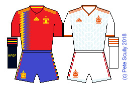 Spain are one of the favourites, for sure. I think they might be able to win it. They should top their group, though it is not an easy group and has two local derbies for them (Portugal and Morocco). However I can’t quite put their current group of players up there with the 2010 champions. If they win the group their passage to the quarters should be a breeze given how weak the non-Uruguay teams in Group A are. They might meet Argentina in the quarters though and that could mean Madrid vs Barcelona’s star, whose name I will not mention yet. Anyway enough about the football, get to THE KIT. It’s lovely, but only because it is based loosely on the 1994 kit, an adidas template used by Spain among several other teams (France, Strasbourg) which I just adored. Brings back good memories. I was going to buy this kit, because it is tradition for me to get one team’s World Cup shirt each World Cup (let’s see, in 2014 I got France, in 2010 I got England away, in 2006 I got USA, in 2002 I got Ireland, in 1998 I couldn’t afford one, in 1994 I got Ireland, and in 1990 I would only wear Spurs shirts). However I wear red so much less, so I went for another shirt this year. The away kit is interesting, it has a detail reminiscent of adidas shirts from between 1988 and 1992, like a blend of USSR 88 and Arsenal away 92. I think it falls a bit short with the vermillion/orangey trim though. PREDICTION: Top of the group, but out to Argentina in the quarters (even as I write it, I know it not to be true and Spain will likely beat them). KIT: 8/10 home, 6/10 away.
MOROCCO
 I remember Morocco from England’s group in Mexico 86, and have had a soft spot for them ever since. I love it when they put in a bid for the World Cup, which they have done yet again this year (it’s their fifth one I think?). Also Casablanca is one of my favourite films. I don’t know much about their team, although one of my favourite players from the 90s was born in Morocco (though he played for Spain), Nayim, he of the Half Way Line. This kit this year is bog-standard adidas template stuff, nothing special, just in their classic red shirts and green shorts. The away kit is white but the template with the red up top is really stylish, so they get extra points for that. I think they will relish playing against neighbours Spain and Portugal, in the ‘Pillars of Hercules Derby’ (I just made that up, is it actually called that?). However, like the red shirts from Star Trek, they will fall early in the first act. (Yeah I know most of the teams in this group wear red shirts). PREDICTION: Bottom of the group, home early but will unexpectedly win the bid for 2026, annoying Donald Trump quite a lot. KIT: 1/10 home, 4/10 away.
IRAN
 In the last World Cup they had this Uhlsport kit (I think it was Uhlsport) with an Asian Cheetah design and this year they have switched to another adidas template, pretty bog-standard. I’ve said this twice now. In 30 years time they will probably look back at these templates and go oh that was a classic wasn’t it, remember those templates, so cool and clean and classic, a bit like how we look back at some of the less interesting 1990 World Cup shirts now, like retro masterpieces. Iran are a decent team. They were unbeaten in the Asian qualification groups, only letting in 5 goals in 18 matches. Consider that my AYSO Select U10 team recently let in 99 goals in 29 matches and you get an idea for how good that record is. They are a little unfortunate to get Spain and Portugal in their group because otherwise I’d give them a shot. PREDICTION: Third in the group. KIT: 1/10 home, 1/10 away.
GROUP C
FRANCE
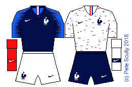 The French are many people’s favourites to win it this year. They have a young squad, exciting players like Pogba and Mbappe, and it is now 20 years since Les Bleus lifted the golden ball of custard aloft in the Stade de France; I wonder what Zidane is doing now, wonder if he is still winning trophies. I think they will go far as well, but alas, like the armies of Napoleon (you know this headline is coming, brace yourselves tabloid readers) they will fall at the last in Russia and be forced to take the long march home. Yes I am saying they will get to the final and lose to Argentina (or maybe Germany, more realistically). I am saying they will beat Brazil in the semis (again probably not realistic). Their kit is in the new Nike template but with the addition of a totally necessary little button on the collar. It’s pretty modern looking. I love that they will again have the classic white shorts and red socks, because they will only wear those once until FIFA says, look France please just wear all blue, we can’t handle more than one colour, thanks dudes. The away kit has a lot of people excited, with the little red and blue marks all over it, but to me it looks like a shirt you’d wear as part of your supermarket staff uniform. PREDICTION: Top of group C. Winners against Nigeria. Vanquishers of Portugal, Conquerors of Brazil. Unlucky against Argentina; they’ll lose the final. KIT: 7/10 home, 5/10 away.
PERU
 Memories of 1978 are pretty distant for me now. All I can say is that I probably ate cat poo and definitely scribbled in a lot of my brother’s Beano comics. So I don’t really have the nostalgia for the Peru team of that time (Teofilo Cubillas, the great red sash on white, a really-convenient-for-hosts-Argentina 6-0 defeat against Argentina). I do remember the Baddiel and Skinner ‘Phoenix from the flames’ episode though. Peru were the very last team to qualify for this year’s World Cup, beating New Zealand in a play-off. They have such a good kit, everyone says, remembering not this one but the 1978 one. It is a Classic of World Football, no doubt, because it is slightly more inventive than simple white or red shirts. The kit this year is made by Umbro, their last one by the British firm (and the only Umbro kit of Russia 2018), and it is a decent effort, with maybe a trim or two too many. The away kit is almost a reverse. However just seeing that sash will bring back floods of 1978 memories to a bunch of people from a certain generation, or maybe they will suddenly want to drink a can of Red Stripe. I would love to see them go through but I think Kronenbourg and Carlsberg will lead the group. PREDICTION: 3rd in the group. KIT: 5/10 home, 5/10 away.
DENMARK
 Have I told you all that I love Denmark? Well I love Denmark. You probably haven’t scrolled down this far. I might just talk about strawberries for this post. You won’t read this bit anyway. This whole thing is really just for myself, my future self, to look at in years to come and say, haha look at how my mind worked then, wow I was dumb. I don’t know. I get dumber as the years go by. So does the rest of the world though so at least I am finally following trends. Denmark, I spent a summer there picking strawberries in 1995. Anyone who knows me rolls my eyes like George McFly’s kids when he talks about the Enchantment Under The Sea dance, even though I didn’t dance or meet my wife there, nor punch Biff in the face. I do remember the absolute love of the Dannebrog that the Danes have, and also of the 1992 European Champions team (they were the current champions at the time as well). And strawberries, many ugly strawberries. This Danish team is good because they have Christian Eriksen, one of my beloved Spurs players. The kit is really stylish, with a barely visible X across the middle to remind us of the Danish royal guards (like on the biscuit tin). It is the little hummel chevrons though that make this retro, they are designed as a reminder of the 1986 style. Very subtle but I love it. PREDICTION: 2nd in the group, knocked out in the next round by Argentina. KIT: 7/10 home, 7/10 away.
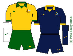
AUSTRALIA
 The Socceroos are more regulars now than wannabes, increasing the English language quota at the World Cup now that the USA and Ireland have stopped qualifying (not to mention Scotland and South Africa, and well it’s been a while for Wales, Northern Ireland and Canada, though New Zealand came close). Lots of other countries speak English though, but this year the most widely spoken language (official language of most countries in the World Cup, not number of speakers) is of course Spanish (8 countries), followed by Arabic (4 countries). French is next (France, Belgium, Switzerland, Senegal), and then English with 3 countries having it as an official language (England, Australia and Nigeria). Australia play in a golden yellow with a dark green trim, just like their far more famous rugby union team. I love it when countries have kits that are different colours than their flag, which I have always felt to be a boring way of choosing a kit. Italy for example playing in azure blue, the colours of the House of Savoy; the famous Dutch oranje (orange); Germany’s traditional white home shirt and green away shirt; Malaysia’s distinctive yellow and black; Japan’s classy Samurai Blue; New Zealand’s All Whites (or All Blacks for rugby). This year’s Nike kit has a distinctive design on the arms; my pixelated drawing makes it look like zebra stripes but it really is nothing like that, it was the best I could do in MS Paint doing each pixel by hand. The away kit is dark green with a light green flash going up and another going down, for some bloody reason. PREDICTION: Bottom of the group (or ‘top’ if you look at it from an antipodean point of view). KIT: 6/10 home, 5/10 away.
GROUP D
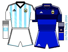
ARGENTINA
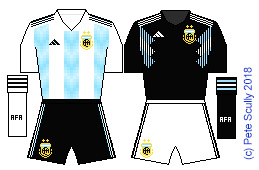 I know they aren’t a great team this year. I know the likelihood of them winning the World Cup is slim. But they have a certain player who may be having his last chance to show us if he is the best player of all time. His name is MESSI. If he helps Argentina win it, he will finally have reached the plateau that Maradona sits on. Messi is no individualist. He is a team player, because everyone likes him more and so we have to say that. Do I really believe he will inspire them to win this time? Yes, I believe it, and even as I write I know my belief will be dashed against a solid dull defensive display from the first solid dull defensive team they play. But we need this! If we want those World Cup dreams, we NEED this. We needed it last time. Do you even remember the Germany team that won it last time? The guy who scored the winner, Gertcha I think he was called, isn’t even coming this time around. Ideally, an ideal world cup final in an ideal world would be Argentina v Portugal, to act as the final chapter in the Messi – Ronaldo story. It is the perfect movie finish and we will not get it. But I still dream. I was 10 when Maradona and Argentina won it in 1986, my son is 10 now. Also, they have some of the best kits. I adore this year’s home shirt, which is a reminder of the early 1990s (when they last won something…), but with a cool graphic design in the stripes. Plus it’s nice to see the black shorts back but again, you know FIFA, they’ll make them wear white shorts. The away kit though is my favourite of this World Cup (except for maybe Nigeria). It’s black and a total retro beauty, but I can’t quite figure out which old Argentine it is based upon. I am hoping it is the one they will wear when beating Germany in the semi-finals (unless Germany wear their extraordinary retro away kit). I actually bought this kit on Saturday. PREDICTION: 1st in the group, fantasy champions overall. Messi-anic. KIT: 9/10 home, 10/10 away.
ICELAND
 Can you believe Iceland, getting to the Euros, then getting to the World Cup? Plus they have 3 for 2 on chicken kievs right now, bargain. Yeah, everybody loves Iceland, and their viking claps (vikings were well known for getting together and doing big handclaps), and that bloke who looks like Thor (God of Thunderclaps), and of course my main man Gylffi Sigurdsson, who looks like Kevin Bacon, who might be one of the Avengers, I don’t know. Iceland have the means to do it, and get into the knock-outs, but I think they will heroically fail this time, but only because I like Nigeria’s kit more (and I want to predict an African team doing better than round one). The Iceland kit is made by Errea, whose shirts I have been a fan of for years, but has a pixelated volcanic lava style design on the upper arms. PREDICTION: 3rd in the group, and we remember the claps for decades to come. KIT: 5/10 home, 5/10 away.
CROATIA
 The Croats have made their famous red and white checkerboard kit with bigger squares this time, though the back is just plain old white, but with red arms. FIFA I think hate that they want a checkerboard kit. They and UEFA hardly ever let them wear it at tournaments (because most teams play in either red or white; boooorinnnng) so they often have to stick with the blue away kit. This year the away is black and blue and looks pretty cool. Given the blue shirted opponents in the group (plus Nigeria whose kit is like WOOOOW) I think we should see more of the home kit, but not much more. I think despite Modric they will go out early. “Don’t Cro Home Too Soon”. “Don’t Cro Fro Me Argentina.” “Yugo Out Early.” “Balkan-trol Lets Croats Down.” I’m clutching at straws here for headlines, or should I say “Zagrebbing at straws”. Ok enough, I am going to Split. Unless Croatia come up with a goal in the Dubrovnik of time. PREDICTION: 4th in the group. “Straight home, as the Cro flies.” KIT: 6/10 home, 4/10 away.
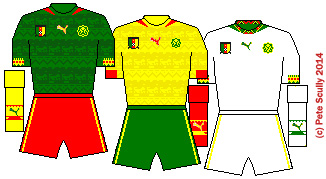
NIGERIA
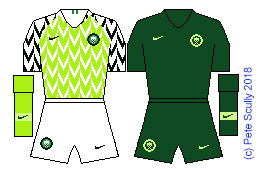 Oh come on. We have a winner. Nigeria have had good kits before but this one is insane. It’s such a fun design. The green is lighter than usual, then there is the black on the arms, it has a total 90s reminder about it. Remember that team from the 94 World Cup (that was by the way my favourite ever Nigeria kit), Amokachi, Amunike, Oliseh, Okocha, celebrating by grabbing the goal net and yelling, I watched that on my tv in my bedroom late at night. I would have loved this kit, but I cannot pull it off. I’m a pasty freckly redhead. I am not worthy of this shirt. It is an instant classic and for that reason, I really want them to get through the groups. Sorry Iceland with your special on Findus Crispy Pancakes, sorry Croatia with your Daily Star sub-editor wishlist of headlines, it is Nigeria who will go through alongside Messi’s Boys. The away kit is dark green and a bit simple but necessary, like having something healthy after a massive ice cream sundae. PREDICTION: 2nd in the group. Winner of all the kit competitions. KIT: 10/10 home, 5/10 away.
If you are still with me, stay tuned for Part Two…
 The Hammers had a dull time at their new stadium last year, but managed to come in 11th, which isn’t that bad. The bottom half of the table last year was pretty rubbish overall, it has to be said.West Ham, aka the Armie Hammers, aka the Jeremy Irons, are still with Umbro who are creating some simple kits, including a black away shirt. The home kit has a two-tone claret design that looks like the chevron shape of one of their kits from around 1978 I think it was? Their sponsor ‘Betway’ sounds like it should be in a list with ‘Between’ and ‘Betwixt’. Where will they come this season? Stay up, probably, but not better than 11th. They will have a third kit, which I believe is white with an ancient style West Ham badge.
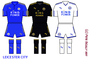 I remember when Leicester won the league. Seems impossible now in the age of multi-billion pound transfers and Pep Guardiola level coaches, but there was a time when teams like Leicester could do the impossible. Innocent times they were. Yes before you say “hang it was only last year”, just think about how different the world was back then in May 2016. Yeah? Now you see what I mean. Leicester managed to stay up after sacking their title-winning manager Ranieri, stopping their slide from Champions League to Championship, and got a respectable 12th place in the end. I think they will be a lot better this year, not champions but challenging for the European places. As long as they can find the net. The kit is ok, sticking with the gold trim again, and staying all blue (I’d like to see white shorts back, personally). Puma have given them decent clean kits again; Leicester never go in for snazzy nonsense.
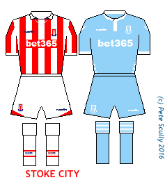
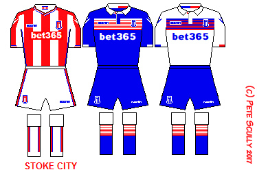 Probably time for Stoke to get relegated, I think. I just don’t see them staying up. The home kit is ok I suppose, the away kit has League One written all over it. The third kit is really imaginative. At least they are made by Macron, also the leader of Free France. Stoke are probably still too good to get relegated but I just have a feeling they will be down there. Mark Hughes might get sacked, I dunno.
 It’s be great if at the centre of Selhurst Park they actually had a Dark Crystal floating above a shaft of air and fire. I like that Palace are in the Premier League and I hope they stay, I want as many London clubs up there as possible (well maybe not QPR). But the thing about Palace being in the PRemier League is that it’s a bit like being really excited about connecting with an old friend from the 90s again, hallo mate how you goin’ mate, wow you aint changed mate, good to see you mate, then friending them on Facebook, and then just being bored by all of their boring posts about work, that’s kind of who Crystal Palace are. If they were a Game of Thrones house they would be House Mallister. Their kit is still made by Macron, who make pretty good kits, but the new sponsor is a bit of a mess. “ManBetx”??
 Gylfi is going to leave Swansea again isn’t he. I love Gylfi Sigurdsson. He looks a bit like a younger Kevin Bacon, but with more Icelandic awesomeness. I though Swansea were going to drop like a dead duck last season (hang on, dead ducks float, right?) and they even had an American manager very briefly, Lord Voldemort’s stunt-double Bob Bradley and he didn’t last very long, but in the end they steadied the ship and stayed afloat. Will they go down this year? Maybe. I hope not, as I want to keep a bit of Welsh in the Premier League. Their away kit is quite Welsh, being in the classic red and green worn by the national team, while the third kit is in the also very patriotically Welsh colours of black and yellow, the colours of the flag of St. David. The home kit is classic Swansea white with black trim, made by Joma, who also make the Sampdoria shirt I own (so I can assure you they are quite good quality).
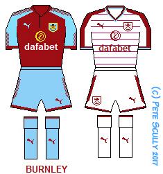 Burnley stayed in the Premier League, I am glad because I quite like them, but I wish their shorts were white this season. They are using a Puma template for the home kit, while the away kit has little horizontal pinstripes running along it that actually consists of the word ‘CLARETS’ over and over again. Which is an anagram of ‘SCARLET’. Frankly, I don’t give a damn. Burnley, like Swansea, also have one of those great Icelandic players we fell for last summer, Jóhann Berg Guðmundsson, who doesn’t look much like Kevin Bacon. Burnley will probably get a third kit, they all do.
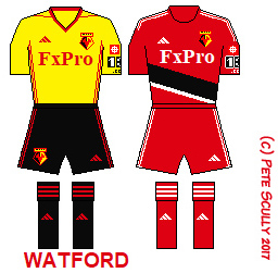 Are we nearly there yet? I should have had a gap here around Watford. I like Watford, they are a kind of nearby club to where I am from (it’s actually about as far as Tottenham is but it’s outside London; the 142 bus goes straight there from Burnt Oak but it takes forever. You don”t care, sorry). There were quite a few Watford fans at my school as a kid (and one of my good friends in England, James, is a big Watford fan), I just remember them all singing about how much they hated Luton, oh they really hate Luton. I can’t say I’m a fan of the airport much. One of the greatest names ever associated with Watford (aside from the famous former owner who worked alongside him to make Watford great in the 80s, Elton John, yes my American friends, that Elton John, big lover of Watford) was Graham Taylor. He died in January and I must say I am very sad, I would have loved to have met him. Sure I fell into the whole ‘calling him a turnip’ category back in the day, when I listened to all the tabloids when he was England manager (only because he subbed off my beloved Gary Lineker) but listening to him talk about the game over the years, he was a proper geezer and right gentleman. However he made Watford play in red shorts (which I like) but Watford fans generally prefer them to play in black shorts. This year they are in adidas, and have an all red away kit, using a template similar to Middlesbrough last year, which looks like a car with some paint on its wheel has driven over it. By the way, did you know Watford is twinned with Whoville? Also with Wensleydale, Ware, Hounslow, Ypres, Wearside and Wichita.
 They had to come back up didn’t they! Led by the great Benitez, the Toon Army (not affiliated with Cartoon Network or Nicktoons) (or iToons), the Magpies and their black and white stripes are back in the big time. This time next year they will probably be back down in the little time again (no, I don’t think so this time, but lads, it’s Newcastle, they will find a way). I have a good mate Simon who is a long-suffering Newcastle fan. I would love it if they did a Man City and got a super rich owner, just love it. Their away kits are boring this year, has to be said. Not kidding anyone with that sponsir either, ‘Fun88’ but it’s better than their old ‘Wonga’ one. Prediction – top half of the table, knock knock knocking on Everton’s door. If they were a Westerosi house, definitely the Starks. Or maybe the Karstarks.
 Yes folks you read that right – BRIGHTON AND HOVE ALBION are in the Premier League! They deserved it too, and their boss is one of my favourite former Spurs players, Chris Hughton. Now I am old enough to remember Brighton, aka The Seagulls, in the top flight back in the 80s, with that big guy Steve Foster who wore the headband, he was a proper Roy of the Rovers style legend (probably because I remember reading about his life story in Roy when I was a kid, remember they used to do that? I never thought I would see Brighton up in among the big boys again but here they are, rubbing shoulders with the likes of Burnley, Watford, Bournemouth, Stoke, Huddersfield, Swansea, and Man City. Their kit is a simple Nike template with the Brighton stripes. I remember when they had stripey shorts too, a long time ago. I think Brighton will stay up, but only just. I stayed up once in Brighton, New Years Eve, all night, went to like seven parties with this group of people, interesting night but I got lost coming back to the place I was kipping over and ended up walking round and round for ages this place called Seven Dials, a roundabout that had seven streets coming off of it. I knew it was one of those streets, but which one, I had no clue. It was very much daylight and 2001 by the time I finally found it. I remember one of the guys living at this house was a Dr Who fan, or a “Brighton Whovian” as a said, instantly thinking that’s a terrible pun as I said it. Like that has ever stopped me saying terrible puns. So anyway, do watch the Seagulls this season, they will really Brighton your day…
 I am so thrilled that Huddersfield are finally in the Premier League. I can’t believe it, it doesn’t sound true. That makes three teams with blue and white stripes in the top flight of English football since I don’t even know when (and one of them isn’t even Sheffield Wednesday). Huddersfield, aka The Terriers, are wearing a really interesting design for their maiden Premier League appearance, the stripes appear to be made of tiny circles. The spots of red really go well with the light blue and white, and they also have one of those sponsors with a lot of Chinese writing beneath it. I have to say I enjoy recreating those in MS Paint, not super acuurately but as best as I can do. The away kit, is, yeah but the third kit is oh my good look at that! My MS Paint skills do it no justice but it is based on an away kit they wore back in the 90s, I think, I do remember it. There were some crazy kits back then, craaaazy kits (I fully approve of 90s crazy kits). Huddersfield were great back in the day, that is almost a century ago, winning three league titles in a row back in the 1920s, yes, Huddersfield have more league title trophies than Spurs. Dammit.
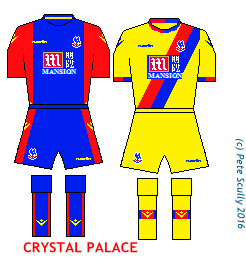 Nice to see Palace still in the top flight, and spending money too. I wish they had won the Cup last year, though Pardew’s little dance was just too much. Will they do well this year? Yeah, they should stay up, because they have a nice pair of kits. The home one seems to have more blue than usual, forgoing the stripes for a large blue band. It’s pretty stylish. The away kit hearkens back to older Palace kits, and I like it when they have a yellow change. The original Crystal Palace was in Hyde Park housing the Great Exhibition of 1851 – the year ironically in which the hated ‘windows tax’ was abolished (you would be taxed for how many windows you had on your house, MPs called it “daylight robbery”), Crystal Palace was a building made entirely of windows). Well, let’s hope Palace prove to give us a “Great Exhibition” this year, otherwise their Premier League status will go out the window. I’m here all week, folks.
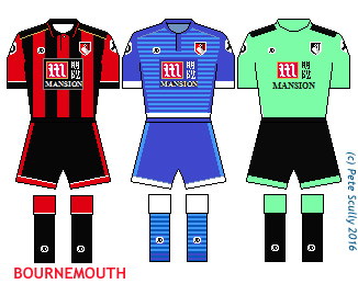 Sorry, this one must have gotten mixed up, there’s no way Bournemouth are still in the Premier League. What? They are? What witchcraft is this, when Bournemouth are in the Premier League, (a league of which Leicester City are the reigning champions?), and they just went and signed Jack Wilshere on loan from Arsenal. Bournemouth is known for being a favourite retirement destination for senior citizens who want to live beside the seaside. Wilshere is in his early 20s, I dunno, kids get older every year don’t they. Their home kit is decent again, the third kit is a bit of an ugly shade of mint ice cream, probably tastes very nice down on the beach though. I love the away kit though, it has a similar design to last year’s Marseille away kit. Bournemouth are the Cherries; let’s hope their season has one on top.
 Ok, I’m sorry, but last year Sunderland were the absolutest shittest. They were dreadful, utterly gobsmackingly awful. So how the bloody hell are they still in the Premier League? Oh right, three teams were actually worse than them. But how? Oh right, Norwich, Newcastle and oh my god you’re right, Aston Villa, they were just crap. Well Sunderland avoided relegation because they brought in Samwise Allardyce, who Don’t Be Goin Down, bro. So they should be ok, because he will keep them up. What? He left? Where is he – what? Managing England? Bloody-hell. At least England will avoid relegation now too. So who did they bring in? Someone good I bet, with a solid record. Hold on, David Moyes? Now, to be fair, he is probably a good man for the job. Nobody in the world could have taken over from Fergie at United, but he was always pretty solid in the past, and there’s no reason he wouldn’t be able to pull Sunderland into shape and keep them up. He won’t though, because unfortunately they have decided on what is by far the ugliest away kit in the whole division, and for that crime against kits they must go down to the EFL and think about what they have done. Also for being the city whose early ‘leave’ vote in the referendum was the moment when the pound plummeted. Although ironically, this meant that it became cheaper for me to buy football kits in England. That purple and hot pink thing though looks a bit too cheap; who would buy that? Except maybe 1980s New-Mutants-era Magneto, he probably would. Verdict this year? Days of Fuchsia Past.
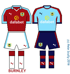


 Last season I predicted that Leicester would be champions. No, no I didn’t. I said they’d either go down (sad Lineker face) or stay up (happy Lineker face). Lineker himself promised to present Match of the Day in his underpants if the Foxes won the League. They only went and did it. Everyone loves Ranieri. Vardy couldn’t stop scoring. Mahrez tore teams apart. They surely can’t do it again, can they, but…you can’t rule out Vardy and the Foxes. Their kits this year are in Leicester’s typically straightforward, nothing silly fashion. The subtle pattern on the shirt is similar to Slovakia’s in the Euros, but otherwise is smart and classy. They ARE the champions.
 In case you were not aware, Arsenal came second last year. Nobody is quite sure how that happened, but it did, and Spurs came third. I was annoyed because Spurs haven’t come above Arsenal for about twenty years, and it came at the end of a season when Spurs were generally mercurial and Arsenal were generally stale, but the table doesn’t lie. I think the impression I got from the players is, 2nd and 3rd, who cares – it’s not 1st, and both go straight into the Champions League, so it’s practically the same – let’s get ready for the Euros. Anyway Arsenal’s kit – the home kit’s collar is a throwback to the team of 92-93, remember Tony Adams dropping Steve Morrow? They won a couple of cups that season, and looking at the table that year, oh, they came two places below Spurs. Away kits are pretty nice. Prediction: Wenger’s final year, but they won’t win it. Maybe.
 If you have ever followed me on Twitter, you will be well aware this is my team. Last season was epic, albeit ending on a down note, but a year ago if anyone said “Spurs will come third” I would have bitten their hand off and thrown away the key. Kane, Alli, Lloris, Alderweireld, Dier, we were so much fun to watch. Spurs will be in the Champions League this year but playing at Wembley, as part of White Hart Lane is already gone, with the rest being demolished at the end of the season. We move into the new ground, being built over part of the current one, in 18-19. This year’s prediction…third would be a very big achievement again, to be fair – we have enough to go all the way, we have a pretty sharp and solid team, bolstered with new boy Jansson, but those billionaire Big Boys want their cake back. Our kits are absolutely lovely. I have so enjoyed the Under Armour years. The home kit is superb, but the away kits are classics. I have the third kit, my son has the second kit. We kick off tomorrow away at Everton. Come on you Spurs!
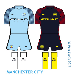 City have a new manager in Pep Guardiola, who has long been coveted by England and finally graces us with his tiki-taka. Being at a club funded by billionaires should make the transition from the biggest club in Germany and one of the two biggest in Spain that bit easier for him, though England is slightly more competitive, and he won’t necessarily walk it. City have a very strong squad though, which probably just needs a bit of managerial know-how. So their kit is ok, the shirt is stylish in that Vapor template Nike really loves, but there go Nike with those different colour socks gimmick they are beating the hell out of this year. The away kit takes that catchphrase even further with unusually wild yellow socks. Verdict? They will get better than fourth, but might not win it.
 nited sacked Van Gaal, and brought in Jose Mourinho. Not content with one massive ego they bought Zlatan Ibrahimovic, who makes sure he is at a club that will win titles every year (I’m surprised Zlatan didn’t sign for Michael Phelps). Then they spent just under a hundred million quid on Paul Pogba, who they let go a few years before. They really really want to win the league again, and sure, they might be in a position to now…but do you remember Chelsea sacking Jose last year? So their kits. The home shirt is bizarre, having two halves of different reds, with a honeycomb border down the middle (I now know that this is because the bee is the symbol of Manchester, hence the honeycombs). The pattern comes up again on the sleeves of their third kit. The second kit is nice; my image doesn’t do the blue pattern much justice, but it’s a nice shade, and I like a United away kit in that sort of blue. Will they win the league? Probably, or maybe not – they have the Europa League to worry about first…
 Ronald Koeman has left, but the Saints have been a decent team the past few years so I expect that to continue. Actually I don’t know. I do know that I love their kit. Under Armour have taken over and this home kit is an unusual design, but it feels like the sort of thing Southampton would do. Even the sponsor works well. Their away kit of grey and dark grey is a little less inspired but looks alright. I bet you anything they get a third kit before the year is out. Where will they finish up this year? Top ten, I reckon. I don’t know. I think when you get to this part of the table you kind of stop caring. They might make Europa League, or they might not. I’m not making for a good pundit, am I.
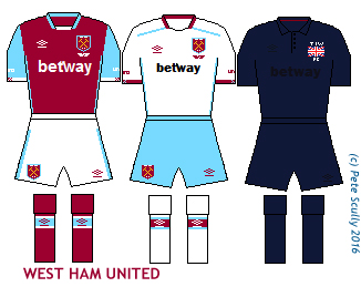 The Hammers left the Boleyn Ground last season as you probably heard, and have moved into the Olympic Stadium in Stratford. That will be an interesting change for them. Their kit is standard claret top with blue arms stuff, nothing fancy. The special commemorative third kit, which is not an all black kit but very very very dark blue, refers to their founding as Thames Ironworks FC (TIWFC), who wore dark blue and one time had a British flag on their chest. West Ham have simplified their badge to just show the crossed hammers once more. Also they have added the word “London” to the badge in case people don’t know which city West Ham is in. Other London clubs have yet to catch on to this, causing massive confusion among the tourists. I doubt it will be a classic first season at Stratford, but a healthy mid-table should do it.
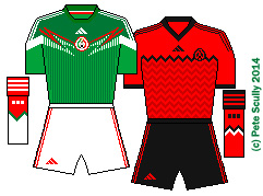
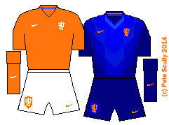
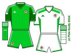


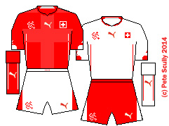
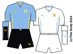

 esert Foxes) have been one of the popular teams in this tournament, and I like their kits. Simple design but with a nice shade of green trim, which from the TV viewers point of view makes them blend in with the pitch. Puma kits tend to be more form-fitting these days so muscular physiques show up more. Some very muscular players in this World Cup too. In Algeria’s green away kit they look rather Hulk-esque.