a peak under the hood

paintbox feb 2025 

I thought it was time I should show my current palette. I have a new smaller sketchbook (a Seawhite of Brighton A6 size that I got in London) for when I need just a pocket-sized sketchbook with me, so I opened it by drawing what paints I am currently using. I don’t use the Seawhites as much any more because (a) they aren’t really as good for watercolours as the watercolour Moleskines I use, and (b) I have to get them when I’m in London, but they are really good for penwork (less so fountain pen, I find, better withe the uni-ball signo pens I prefer). Anyway. You can see from the image above that there are faint lines across it, courtesy of my Epson scanner which has been doing this lately. Not the screen, not the software, just the scanner after many, many scans I guess. Shame as it is fast and quiet, although I’ve never been happy with the quality compared to my old HP. Both were all-in-one printer/scanners. So this week I decided to buy a new flatbed scanner, to deal with this issue. It’s a bit more mobile and light, and has to be connected with a cable and not over wifi, because I decided not to get a more expensive one in case it turned out to be not really better at all. I also stuck with Epson because I am used to the software, even though it’s not really perfect.  I should rescan this, along with other recent sketches where I notice it, but that’s time-consuming; I hate scanning. I did scan the guide (below) with the new scanner, worth pointing out that this was added to the inner cover and that paper never takes watercolour all that well in the Seawhites, so the odd texture is what it looks like, annoyingly. Paper makes a big, big difference. Doesn’t matter, this isn’t my usual paper and it’s just a rough guide for myself to remember what I’m using. I do forget the names of paints a lot. I am not, alas, one of those urban sketchers that enthuses regularly about their paints, I wish I were sometimes but I just make do. I have some nice colours though, and I am so pleased I finally got that Buff Titanium colour by Daniel Smith that I’ve seen in many other urban sketchers’ palettes over the years, it’s well nice for those slightly off-white houses and objects, it’s like a missing link in my paintset. Those QOR ones I have in there, actually those are just small blobs from the tubes, they can be pretty powerful paints and I like to use those as just a palette of three by themselves, that’s fun. The box itself is a Winsor and Newton ‘Complete Pocket Set’ size box which I find to be perfect; those come with about 16 half pans but there’s room for a lot more and I cram them in. I like the small size and the little fold out plastic thing on the bottom to hook under my thumb. This is my third one of these since 2007, and I just got this one in November because I broke the little thumb-handle on my other one, and then while trying to balance it I dropped it onto the pavement and broke the lid, which was a pain (I was carrying it round with elastic bands holding it together). This size has worked best for me over the years though, especially in a tight space like a bar or standing on a narrow sidewalk.  Anyway. The list of all the paints is below, and I’m not explaining how I use them, because I just hit and hope most of the time. Still it’s always fun to take a look inside a paintbox…  

my palette for february 2025


Most of these are Winsor and Newton, mostly in the ‘Cotman’ range but a few in the ‘Artist’ range, mostly half-pan but a few tube. The rest are Daniel Smith (indiciated as ‘DS’) mostly from a tube, one or two might be half-pan, and there’s those three QOR ones too. Also, the ‘bronze’ is a metallic Winsor and Newton watercolour, it’s much shinier in real life than on the screen.

Top row: Ultramarine, Cobalt Blue, Turquoise, Cerulean Blue, Hookers Green Light, Viridian, Sap Green, Phthalo Yellow Green (DS)

Second Row: Purple Lake, Permanent Rose, Quinacridone Rose (DS), Winsor Red, Orange, Cadmium Yellow Hue, Lemon Yellow

Bottom Left Corner (clockwise): Lamp Black, Buff Titanium, Chinese White, Payne’s Grey Middle Bottom: Bronze (Metallic W+N), Ultramarine (QOR), Quinacridone Magenta (QOR), Nickel Azo Yellow (QOR)

Bottom Right (Clockwise): Burnt Sienna, Yellow Ochre, Burnt Umber, Transparent Red Oxide (DS)

sacramento to kahului (and back)

airplane view A 122823 sm

We flew over the Pacific to the Hawaiian island of Maui just after Christmas, for our festive tropical new year break. That was amazing. We did have to get up super early in the morning to get to the airport and catch our 7am plane, which we did (though Sacramento airport was very busy), and had dramatic skies as the sun was coming up. We flew on a Boeing 737-Max-8, blissfully unaware of the problems that the Max-9 would have a week later when part of one came off shortly after take-off. Yeah let’s not think about that scary situation. As Superman says, flying is still the safest way to travel. Easy for him to say. Still the view was beautiful. I always have to do a bit of drawing when I fly, it helps me relax. Looking out of the window I tried to capture the colours and textures of the sky in my little Fabriano Venezia book.

airplane view B 122823 sm

It’s nearly six hours from Sacramento to Kahului, the main airport on Maui. Maui is a beautiful place, though it has suffered a lot in 2023 with devastating fires, namely the terrifying disaster than befell the historic capital Lahaina. I sketched there in 2019, when we visited on New Year’s Eve. While the buildings were destroyed, the historic Banyan Tree has survived, albeit terribly damaged. We were going to stay in Wailea, where we stayed on that previous trip, on the south-western part of Maui. We flew out with Southwest, and on the way we were able to watch the Tottenham game against Brighton & Hove Albion. Should win that right? We lost 4-2, and we were 4-0 down when we landed, so there was a little bit more Norf London Language than usual on this flight. (We made up for it by beating Bournemouth a few days later, but seriously, we were ravaged by injuries and suspensions).

Airplane sketch SMF-OGG sm

I have a few Maui sketches to post, I wasn’t going to do a lot of sketching what with being in the ocean and the pool and playing my ukulele by the sea, but you know I can’t help myself. I’ll post those later. Below is the sketch from the flight home, this was the flight on the 737-Max-8 (I can’t remember what the plane was going out there, it wasn’t a Max-8 or 9), and they have a handy little tray that pops down where you can clamp in your phone or iPad to watch things on there, a very handy feature. It would still get sucked out if the window fell off though. I don’t think I watched much, a couple of episodes of ‘Marvel’s What If’, mostly just listened to podcasts and sketched, this time in that brown fountain pen. Buy the time we got home it was raining hard in the Sacramento valley, and a lot colder than the mid-80s of Maui. Happy New Year!

Airplane sketch OGG-SMF 010224 sm

spring paintbox

watercolour palette 043023 sm

I decided to paint my current watercolour palette. I’m already thinking of changing out some of the paints. I’m using a mixture of brands, mostly Winsor and Newton Cotman, the cheaper ones with less intense colours (I always like that), a few of the Winsor and Newton Professional colours (some are a bit too bold, like Winsor Red, some work well), some Daniel Smith paints (which are mostly pretty bright, though they are often to be used sparingly because of their intensity, like the Phthalo Green) and I also have one QOR paint in there, the Ultramarine, which is intense but utterly beautiful and always looks good, especially when used in foliage against a green. Those few QOR brand paints I have are amazing. I am not a paint brand person, I don’t really go on about the perfect palette or really care too much, but I know what I need when I’m out and about, and some colours are better for certain places than others. I’m a drawer not a painter, but I use these to colour my drawings in. I really like using the Daniel Smith Manganese Blue hue for a sky, but also like a little touch of W&N Cobalt Blue in there to cool it down. I still mix up Payne’s Gray, W&N Ultramarine and Purple Lake to get my shadows, in various combinations. I’m probably gonna ditch that Hansa Yellow Deep experiment and go back to regular old Cadmium Yellow Hue. I bloody love the DS Transparent Red Oxide, which is a type of brown, and not as transparent as you’d expect, but produces an amazing colour. I’m still using those Faber Castell waterbrushes, I do have some other ones I got recently but haven’t used them as much yet. I have some regular paint brushes and a little pot of water too, but that’s more for when I’m painting at home, and I never have very good quality brushes, just a few that work ok for me. I like carrying around the little palette of 24 colours. Anyway these are my current paints, and I’ll probably change them out again next week. I just wanted to see what they all looked like on that Fabriano watercolour paper. I’d been a little concerned the colours weren’t showing up as vibrant as I’d expected on it, for whatever reason, and they do react differently than in the smoother pressed Moleskine watercolour. Anyway, that book is finished now. I still have to scan it all in though.

Berkeley time

Durant Berkeley 041623

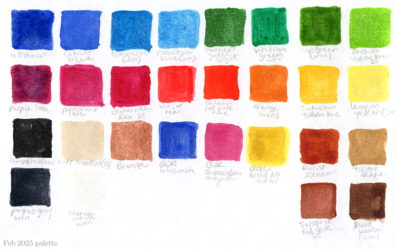
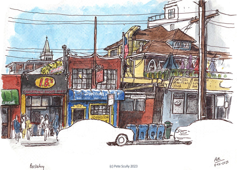
In mid-April, I went to a conference in Berkeley, the UC-AMP conference (standing for University of California Administrative Managerial Professionals, me being a manager type these days). It was actually one of the better conferences I’d ever been to and I sketched a lot; I’ll stick the conference sketches in the next post. I did take the chance to sketch a bit more of Berkeley though, a palce I’ve drawn a lot over the years, but don’t go to as often these days. I was also starting a new sketchbook, one I’d never actually used before, a Fabriano watercolour book. Same general size and format as my other sketchbooks (that roughly 5.5×8″ size in landscape, slightly bigger than my watercolor Moleskines, smaller than the Stillman & Birn Alpha, but about the size of the Seawhite of Brighton books I used to use). The paper was a bit coarser, a bit thicker, and this would be an experiment. Basically, I was having a bit of trouble getting hold of the usual watercolour Moley, noweher seemed to have it in stock, and so on a whim I tried this. It was ok, I didn’t really love it, the pen had to work a little harder, but the paints too did not always act in the same way as in the Moley, in a way I can’t really describe but never mattered when using similar Fabriano watercolour paper at home, but out on the streets seemed to be a bit different. Paper matters, and I’m fussy. (I’ve actually finished the sketchbook now; while still not my favourite, I got used to it and got around it by washing the pages with a light sheen of watercolour paint ahead of time, making it much easier to work on, a preparation I never had to do on the nice Moleskine pages). So, I stood outside the Berkeley Games shop on Durant, just off Telegraph, and drew the colourful scene ahead of me. That games shop is massive. I have a friend in London who has in recent years become a massive serious board games fan, and would love this place. The weather was warm, cooler than Davis of course, with a lot of characters about the streets. I’m less into Berkeley than I used to be, as a place, largely because of some of the people that roam about making you feel uncomfortable. Shortly after leaving the BART station I was yelled at by a random wild-eyed guy who started following me, asking if I work for the university, and telling me in a shower of expletives that they have been following him and monitoring him and what he would do to those people and their families and their children, which wasn’t very nice in the middle of the day. Another guy sat on Shattuck started yelling at me recently when I was with my family because I was wearing an Adidas hat and he didn’t like Adidas, and that because I wore Adidas I was a Nazi, and then kept yelling “That guy’s a Nazi!” at me as I tried to cross the road, doing my best to ignore the weirdo. Try that in Burnt Oak, mate. People out there getting aggressive and bizarre, you have to ignore, but it doesn’t make it feel like a nice place to go. Still, Berkeley is Berkeley. I finished up and went back to the hotel where the conference was taking place, to attend the reception.

Tupper & Reed Berkeley

After reception food and chat, and a little wine, I was a bit full to eat dinner but still decided to head out to find a historic bar called Tupper and Reed. The evening activities for the conference the next day would be either (a) attend a baseball game, which I did, or (b) go on a bar crawl of Berkeley, that classic Monday evening activity. One of the places they would go though was Tupper and Reed, an old wooden bar on Shattuck that’s about a century old. Described in the conference materials as being like something out of Harry Potter, all brick and wood and presumably wizards and dark magic, “and they even have a beautiful retro record player sitting at the far end of the bar!” (just like Harry Potter, eh). It was built in 1925 and is quite nice, has a lovely old fireplace, though I have to be honest, it felt a little clean. Nice enough. People seemed cool, it wasn’t too crowded and the staff and patrons were friendly. There were some people playing pool, and the music was right up my cup of tea, 90s and 80s stuff that would probably have been on my Walkman back then. This is though primarily a cocktail bar, and so they had some very fancy cocktails. I decided to try one called a ‘Flying V’, because of the guitar themed name, and I think it was nice, but I could not drink very much of it. I mostly drank the bottle of tap water I got to go with it, bit too strong for my liking. Still I got a decent sketch out of the evening, and went off to bed. My hotel was very close by, and I was up on the 16th floor.

UCAMP23-View from hotel sm

And what a view that was! You could see the Golden Gate Bridge from my bed. I woke up early before the conference, and did a drawing of the view. I went back to add a bit more at various points but I had to get this view down. I love a high-up view. Remember that one I did in San Francisco a couple of years ago, from the Hilton Financial District? In enjoyed that. It’s like a jigsaw puzzle, putting these scenes together. I decided against putting all the windows in that building opposite, just a suggestion, you can imagine the rest. I did have a conference to get to though, which thankfully was only thirteen floors below in a fast elevator. It was so nice having everything take place in the same hotel. The previous UC Berkeley hosted conference I went to, in 2017, was a bit more spread out about the campus, which was a bit more tiring. I also did not stay overnight, but took the early train down and back again in the evenings, so it was pretty tiring. This was better.

UCAMP23-Wellman Hall

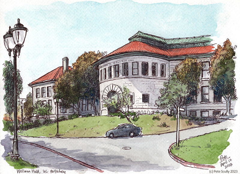
That said, after the workshops and talks were all done, I did go out and explore campus a bit more, because there is always something to sketch. There was a walking tour of campus for many of the participants, but I decided not to do that, and stood outside the magnificent Wellman Hall with my awkward sketchbook. At one point the tour group passed me by. It was a little breezy, and the pages kept flipping up because I only had one elastic band with me to hold them down. The shade of the tree I was under also kept moving, deliberately I assume, in an effort to annoy me. Plus this paper just wasn’t quite right, was it. I hope nobody on the tour heard me swearing at the universe. In the end i took a photo of my sketch and posted it on my Instagram, and remembered to include the conference hashtag because they’d said to do so. Well I’m glad I did; this unexpectedly won the conference’s picture competition!!  They announced that on the last day, to my surprise. Apparently I win free registration to next year’s conference, in Riverside, and I was already looking forward to going to that so that was a nice prize. But yes, I did kind of fight with myself to draw this one, and I was pleased to go and sit down for a bit in the shade afterwards.

Amoeba Berkeley 041823

On the last day, after the last speeches and talks, I took a last stroll up Telegraph, firstly to find that place that does the Belgian waffles my son really likes (I had to send him a picture of one and of course eat one myself), and do another sketch, this time of Amoeba Music on Telegraph. I remember the first time I went to Amoeba, it was the one on Haight, back in 2002. I first came to this one in 2005, right after we moved to the US, when we were checking out Berkeley as a potential place to live. My wife was interviewing at UC Berkeley (if memory serves she got the job, but had in the meantime accepted a position in Davis, and so that’s where our lives ended up, the rest is sketchbook history). I loved a record store, and if I recall correctly I bought a Paul Weller CD here. I chatted with a nice guy for a bit while I sketched who works for the Telegraph business association (we talked a lot about Lego), and it reminded me that this is a thriving little community here, that people are rightly proud of. I’m glad to see Amoeba still doing well too, though I didn’t have time to go in and look around this time.

I did pop into a little art shop that I had been into before though. And what did I get in there? A new watercolour Moleskine sketchbook. Having been a bit back ordered online, and not in any of my local shops, they had one here, and for a good price too (ten bucks cheaper than listed on the Moleskine site). But of course because I have a policy of not starting a new ‘primary’ sketchbook until I have finished the current one, I did not abandon the Fabriano one, and used it all the way through my recent London trip (the sketches of which I’ll probably post in about 2028, I did so many), and just started the new book last week, at the Victoria and Albert Museum of all places. So it all worked out.

outside the bubble

bubble belly davis I’ve been drawing outside a lot lately. Trying to make up for lost time, taking advantage of cooler weather and safer air, getting it in before it gets rainy (haha, ok), and despite the fact there’s very little left in Davis I feel I absolutely need to go and draw (boy am I missing travel) it’s nice to be out and sketching. In these trying times, these stressful times, these unprecedented – you get the idea – it’s a good stress reliever. This is another one with the fountain pen and black ink, which lets me have a bit more value to the dark shades. It’s that funny looking building on G St, currently home to Bubble Belly, which I think sells baby clothes. Actually the weather was still warm – in fact up to last week we were still having 90 degree plus temperatures. What an October.

windows of colour

paintbox july 2019
Ahead of the Amsterdam Urban Sketching Symposium, I decided I needed to deal with my paintbox. I rearranged the colours, took some out, added some in, refreshed them all, and this is my paletter this summer. These are all Winsor and Newton watercolour paints, mostly Cotman but with one or two Artist’s ones in there too. I like using this, the deluxe sketchers box, it fits into my hand or attached to the other page of the sketchbook with a rubber band pretty well. I needed to make a guide to the colours in case I forget, so that’s what this is. This could be a new advent calendar, 24 colours, actually that is not a bad idea. I have some new brushes I just bought as well, bigger than I usually use, so that I can paint on bigger paper for some of the workshops I am taking. I got some 11×14 Fabriano paper, which is not I must say really urban sketching material, being really big an not able to fit into a small bag. However I’m keen try something new, and the big pad of paper just about fits into my gym bag (but it only barely fits into my new suitcase, which is small). This paint set however is very small and compact, and fits a lot of stuff in there, the way I like it.

wright here wright now

Wright Hall

This is Celeste Turner Wright Hall, a colourfully painted building on the UC Davis campus, home to the Main Theatre and to the Department of Theatre and Dance. Yes, that’s spelled “Theatre” not “Theater”. This building was named after Celeste Turner Wright, who was the first tenured female faculty member at UC Davis. She was also the first drama instructor on campus; you can find out more about her long and illustrious career here. This building was built in the 1960s and was famously photographed by Ansel Adams. In front there are a couple of Robert Arneson’s Eggheads called “Yin and Yang”.  I sketched it last week at lunchtime, furiously drawing as much as possible. but added most of the colour later. Oh, click on the image if you want to see it larger.

Hey I thought you might like to see this, the first time I ever sketched it, which was back in November 2006. I remember doing this and loving playing with all the paint, still actually one of my favourite Davis sketches, mostly because it’s so different from what I do now, but also it was still that first year here, still discovering everything. Looking back, it really took me a lot of time to settle in, even though I worked both on campus and downtown and explored whenever I could, riding around on my bike in the stupid, ridiculous heat. Well, I’m still here, still exploring.

2006 Wright Hall sketch

that is you can’t you know tune in but it’s alright

little prague tonight

I went out last night to my local pub Little Prague (I’ve sketched there once or twice before) with fellow Davis sketcher Steve Wright, to draw a German band who were playing (I’ll scan that in later) and do some more bar drawing. I decided to do some more paint-splattering on the paper first, since that effect would look good on a theme such as this. I splattered fairly subtle tones, and this made it feel like I was drawing on craft paper rather than in the moleskine, which was a nice feeling. Steve drew into his regular moleskine, and produced some amazing work using both micron pen and watercolours, both of which I had never been able to use in the regular moley – but he made it work really well! Pleasure to sketch with him. I stuck to a sepia wash, still trying to draw bottles (I seem to have some problem with sketching bottles, hence my recent practising). This is a particularly interesting bar area to sketch though, and the bar staff were very friendly and checked up on our sketching progress from time to time.

That beer in the foreground is a Krusovice dark, a very nice beer. You can spot me in the background there.

art, music and architecture about

gary at avid reader

On Friday I went to the 2nd Davis Art About. I say ‘went to’, it is in fact a whole collection of evening exhibitions in stores and businesses around downtown Davis, exhibits of local artists, and art events, and it was a lot of fun. I wish I hadn’t eaten so much at dinner though, because they all had snacks and wine. I liked the oil paintings of Davis by Andrew Dorn, which were on show at the USE Credit union, and also the large close-ups of freight trains by Marieke De Waard, displayed at clothing store Riki. I ended up at the Avid Reader on 2nd Street (where I worked, once upon a time), and admired the pastels of Kathryn Esterly. I did a sketch of Gary, local KDVS DJ and a guy I’ve known for years, playing his ukelele as he does every Friday at the bookstore. I used to enjoy those Friday evenings at the boosktore listening to that gentle music.  

michael corbett at avid reader

I decided to stick around for the book talk, which was to be given by Michael Corbett. I’m glad I did, for it was very interesting – Corbett is a famous architect, who designed the groundbreaking Village Homes in west Davis. He is also a former Mayor of Davis, and is responsible for a lot of how the city I draw daily actually looks today. His new book, “The Poetry of Architecture”, is a look at how architecture affects our ability to think, and explores architecture across Europe – it looks like a great read. I sketched him talking; he is very tall.

Look at me drawing people. I hope to draw some more. After this, I went to Little Prague to draw the German band I hoped to sketch, but they were just finishing up; I’ll have to go back in two weeks.

the medicine chest of the soul

shields library, uc davis

I like symmetrical pages in my sketchbooks, and this one is opposite the G Street pub (not geographically, don’t go looking it up on Street View, it’s in the moleskine). Appropriately, it’s the UC Davis Shields Library, possibly the opposite of the aforementioned pub. Here you borrow books; there you buy beer. There you can listen to, well, not very good experimental bands, here you can read Ibsen. But, you can’t drink your beer in the library (not that I’ve ever wanted to), while you can read library books in the pub (now that I have done), but only if you sit near a neon lamp.  

ibsen on the shelf

I love libraries, especially academic ones. When we first moved to Davis I spent a lot of time in here, browsing the medieval language section. It’s very peaceful.

“A great library contains the diary of the human race.” – George Mercer Dawson

“A truly great library contains something in it to offend everyone.”  – Jo Godwin