a peak under the hood

paintbox feb 2025 

I thought it was time I should show my current palette. I have a new smaller sketchbook (a Seawhite of Brighton A6 size that I got in London) for when I need just a pocket-sized sketchbook with me, so I opened it by drawing what paints I am currently using. I don’t use the Seawhites as much any more because (a) they aren’t really as good for watercolours as the watercolour Moleskines I use, and (b) I have to get them when I’m in London, but they are really good for penwork (less so fountain pen, I find, better withe the uni-ball signo pens I prefer). Anyway. You can see from the image above that there are faint lines across it, courtesy of my Epson scanner which has been doing this lately. Not the screen, not the software, just the scanner after many, many scans I guess. Shame as it is fast and quiet, although I’ve never been happy with the quality compared to my old HP. Both were all-in-one printer/scanners. So this week I decided to buy a new flatbed scanner, to deal with this issue. It’s a bit more mobile and light, and has to be connected with a cable and not over wifi, because I decided not to get a more expensive one in case it turned out to be not really better at all. I also stuck with Epson because I am used to the software, even though it’s not really perfect.  I should rescan this, along with other recent sketches where I notice it, but that’s time-consuming; I hate scanning. I did scan the guide (below) with the new scanner, worth pointing out that this was added to the inner cover and that paper never takes watercolour all that well in the Seawhites, so the odd texture is what it looks like, annoyingly. Paper makes a big, big difference. Doesn’t matter, this isn’t my usual paper and it’s just a rough guide for myself to remember what I’m using. I do forget the names of paints a lot. I am not, alas, one of those urban sketchers that enthuses regularly about their paints, I wish I were sometimes but I just make do. I have some nice colours though, and I am so pleased I finally got that Buff Titanium colour by Daniel Smith that I’ve seen in many other urban sketchers’ palettes over the years, it’s well nice for those slightly off-white houses and objects, it’s like a missing link in my paintset. Those QOR ones I have in there, actually those are just small blobs from the tubes, they can be pretty powerful paints and I like to use those as just a palette of three by themselves, that’s fun. The box itself is a Winsor and Newton ‘Complete Pocket Set’ size box which I find to be perfect; those come with about 16 half pans but there’s room for a lot more and I cram them in. I like the small size and the little fold out plastic thing on the bottom to hook under my thumb. This is my third one of these since 2007, and I just got this one in November because I broke the little thumb-handle on my other one, and then while trying to balance it I dropped it onto the pavement and broke the lid, which was a pain (I was carrying it round with elastic bands holding it together). This size has worked best for me over the years though, especially in a tight space like a bar or standing on a narrow sidewalk.  Anyway. The list of all the paints is below, and I’m not explaining how I use them, because I just hit and hope most of the time. Still it’s always fun to take a look inside a paintbox…  

my palette for february 2025


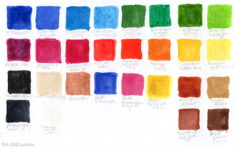
Most of these are Winsor and Newton, mostly in the ‘Cotman’ range but a few in the ‘Artist’ range, mostly half-pan but a few tube. The rest are Daniel Smith (indiciated as ‘DS’) mostly from a tube, one or two might be half-pan, and there’s those three QOR ones too. Also, the ‘bronze’ is a metallic Winsor and Newton watercolour, it’s much shinier in real life than on the screen.

Top row: Ultramarine, Cobalt Blue, Turquoise, Cerulean Blue, Hookers Green Light, Viridian, Sap Green, Phthalo Yellow Green (DS)

Second Row: Purple Lake, Permanent Rose, Quinacridone Rose (DS), Winsor Red, Orange, Cadmium Yellow Hue, Lemon Yellow

Bottom Left Corner (clockwise): Lamp Black, Buff Titanium, Chinese White, Payne’s Grey Middle Bottom: Bronze (Metallic W+N), Ultramarine (QOR), Quinacridone Magenta (QOR), Nickel Azo Yellow (QOR)

Bottom Right (Clockwise): Burnt Sienna, Yellow Ochre, Burnt Umber, Transparent Red Oxide (DS)

spring paintbox

watercolour palette 043023 sm

I decided to paint my current watercolour palette. I’m already thinking of changing out some of the paints. I’m using a mixture of brands, mostly Winsor and Newton Cotman, the cheaper ones with less intense colours (I always like that), a few of the Winsor and Newton Professional colours (some are a bit too bold, like Winsor Red, some work well), some Daniel Smith paints (which are mostly pretty bright, though they are often to be used sparingly because of their intensity, like the Phthalo Green) and I also have one QOR paint in there, the Ultramarine, which is intense but utterly beautiful and always looks good, especially when used in foliage against a green. Those few QOR brand paints I have are amazing. I am not a paint brand person, I don’t really go on about the perfect palette or really care too much, but I know what I need when I’m out and about, and some colours are better for certain places than others. I’m a drawer not a painter, but I use these to colour my drawings in. I really like using the Daniel Smith Manganese Blue hue for a sky, but also like a little touch of W&N Cobalt Blue in there to cool it down. I still mix up Payne’s Gray, W&N Ultramarine and Purple Lake to get my shadows, in various combinations. I’m probably gonna ditch that Hansa Yellow Deep experiment and go back to regular old Cadmium Yellow Hue. I bloody love the DS Transparent Red Oxide, which is a type of brown, and not as transparent as you’d expect, but produces an amazing colour. I’m still using those Faber Castell waterbrushes, I do have some other ones I got recently but haven’t used them as much yet. I have some regular paint brushes and a little pot of water too, but that’s more for when I’m painting at home, and I never have very good quality brushes, just a few that work ok for me. I like carrying around the little palette of 24 colours. Anyway these are my current paints, and I’ll probably change them out again next week. I just wanted to see what they all looked like on that Fabriano watercolour paper. I’d been a little concerned the colours weren’t showing up as vibrant as I’d expected on it, for whatever reason, and they do react differently than in the smoother pressed Moleskine watercolour. Anyway, that book is finished now. I still have to scan it all in though.

windows of colour

paintbox july 2019
Ahead of the Amsterdam Urban Sketching Symposium, I decided I needed to deal with my paintbox. I rearranged the colours, took some out, added some in, refreshed them all, and this is my paletter this summer. These are all Winsor and Newton watercolour paints, mostly Cotman but with one or two Artist’s ones in there too. I like using this, the deluxe sketchers box, it fits into my hand or attached to the other page of the sketchbook with a rubber band pretty well. I needed to make a guide to the colours in case I forget, so that’s what this is. This could be a new advent calendar, 24 colours, actually that is not a bad idea. I have some new brushes I just bought as well, bigger than I usually use, so that I can paint on bigger paper for some of the workshops I am taking. I got some 11×14 Fabriano paper, which is not I must say really urban sketching material, being really big an not able to fit into a small bag. However I’m keen try something new, and the big pad of paper just about fits into my gym bag (but it only barely fits into my new suitcase, which is small). This paint set however is very small and compact, and fits a lot of stuff in there, the way I like it.

a look at the book of the art of urban sketching

The Art of Urban Sketching

I am really enjoying The Art of Urban Sketching. It’s also fun seeing people from all around the world enjoying it as much as I am, and hopefully being inspired to get out and draw by every page. I like it so much, that I will be at the Avid Reader bookstore on 2nd St, Davis this Friday, Feb 24th at 7:30pm, talking about the book, about Urban Sketchers, and about urban sketching in general. If you fancy coming along to hear me yap on and on and maybe pick up a copy of the book (and support one of your local independent stores), pop by the Avid Reader at half seven this Friday evening!

PS: here is an excellent video of Gabi Campanario, the book’s author and founder of Urban Sketchers, talking about the book on local Seattle TV this week along with Gail Wong of the Seattle Urban Sketchers group. Enjoy!

The Avid Reader, Davis

The Art of Urban Sketching (Facebook page)

Urban Sketchers

tomorrow never knows

paint box

When it comes to packing for a trip you have to be strategic. Clothes, well that’s quite easy for me. I travel fairly light, I know what I like and there it is, I’m packed. I’ve been packed for days. Art materials, well that’s a different teapot of sardines. Even though I should have it down, I have to pore for ages over which pens to bring and which to leave behind, which pens still kinda work ok and which have worn down nibs but are good back-ups for the more intense cross-hatching of those trees I need to draw. My Winsor and Newton Cotman paints have been filled with all manner of possible colours for a while, but since drawing the above sketch – in my new small red moleskine, which is acting as a kind of journal / place for smaller quicker sketches for the upcoming London/Lisbon trip – I have added another paint to the set, Prussian Blue, because four blues just wasn’t enough. “You Never Know,” that seems to be the catchphrase. Just look at all the pens which made the final cut! That is mental, no truly it is mental. I am trying to cover all my bases, but I’m probably going to shave quite a few off this. Still, it is the 2nd International Urban Sketching Symposium, and when it comes to my sketching needs, You Never Know.

Art gear for lisbon